INTRO

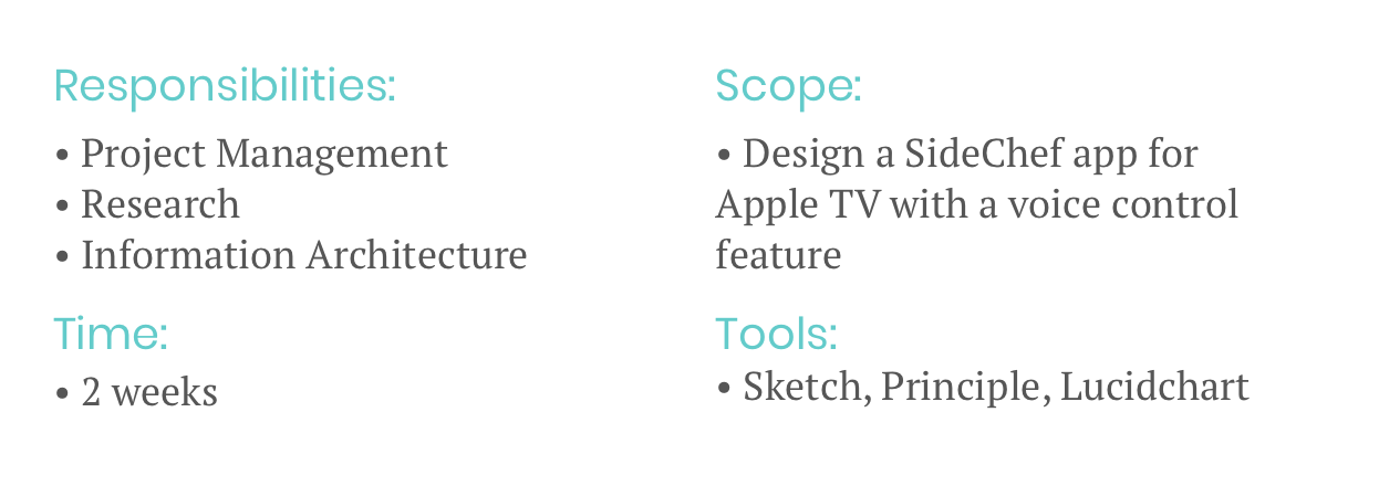
This was a concept project conducted over the course of a two week design sprint. My role as Project Manager required communication skills and critical thinking.
Other responsibilities included conducting interviews and usability tests, synthesizing data, sketching, and designing wireframes.
What is it?
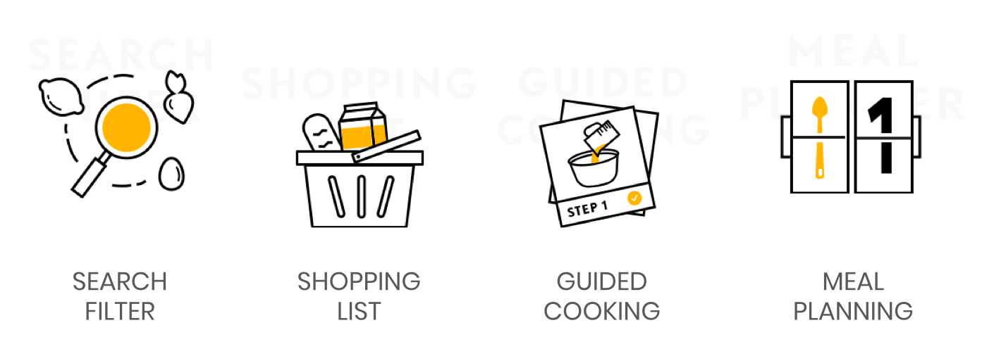
SideChef is a mobile and web platform with over 255k monthly downloads. It provides users with thousands of recipes to search according to ingredients and taste, a shopping list that connects to Amazon Fresh for food delivery, guided cooking steps, and meal planning.
RESEARCH

Getting to know the existing mobile platform:
User observation revealed the guided cooking steps had severe usability issues.
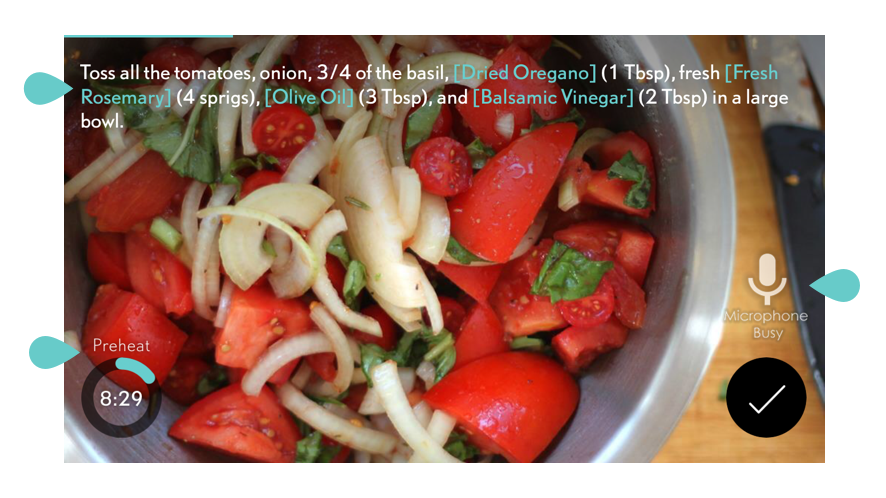
The microphone malfunctioned or would lag, flashing “busy,” long after receiving a voice command.
Users still had to use hands to control timer, to view instructional videos, and view ingredients.
Timers would start unsolicited, even if the user was browsing ahead, which caused confusion and frustration.
There were no clear “back” or “exit” buttons.
Experience of cooking without the app.
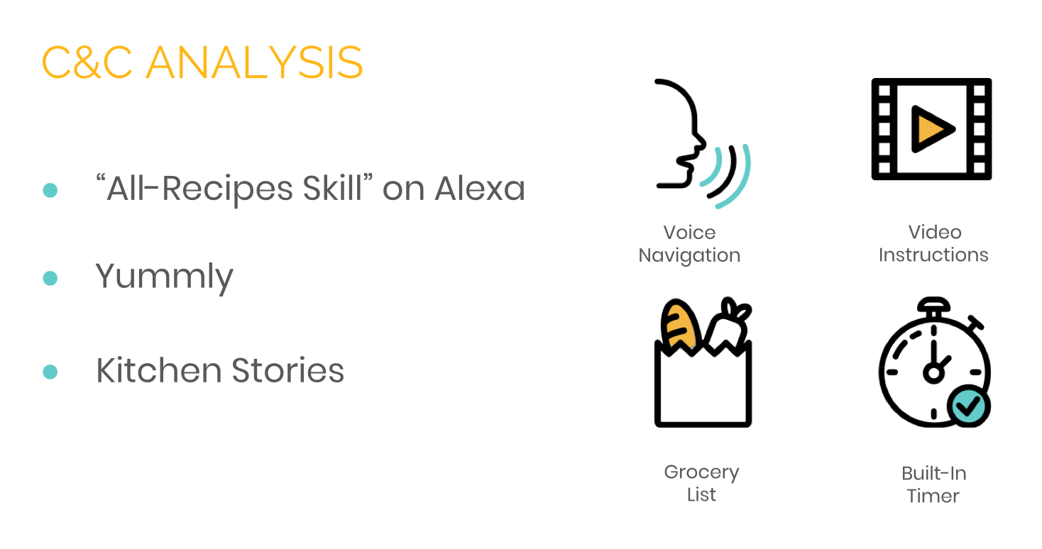
Getting to know the competition:
All of our competitors had some combination of these features, but none of them were contained in a single app.
Getting to know the users:
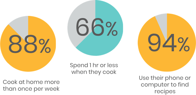
Through interviews and surveys we were able to learn more about our millennial user base:
“Solve the fridge puzzle.”
“You gotta find the most convenient way to do it. To cut down on cooking time.”
The user persona:
All this research was enough to tell us that there was a market for our product in our target demographic. However, only 11% of those surveyed actually owned an AppleTV… So why build on this platform?
Well, for starters the company already has a mobile app and this would allow us to diversify their offerings. Second, this would be the first cooking app available on AppleTV, essentially cornering the market. Third, the TV platform also offered some exciting design opportunities, which will be detailed below in the Synthesis section of the case study.
This doesn’t mean we ignored all of our user data, either. Surveys and interviews continued serving a great purpose in designing the app interface, usability tests.
Synthesis

Feature Prioritization
Evaluation of different features with the MOSCOW method.
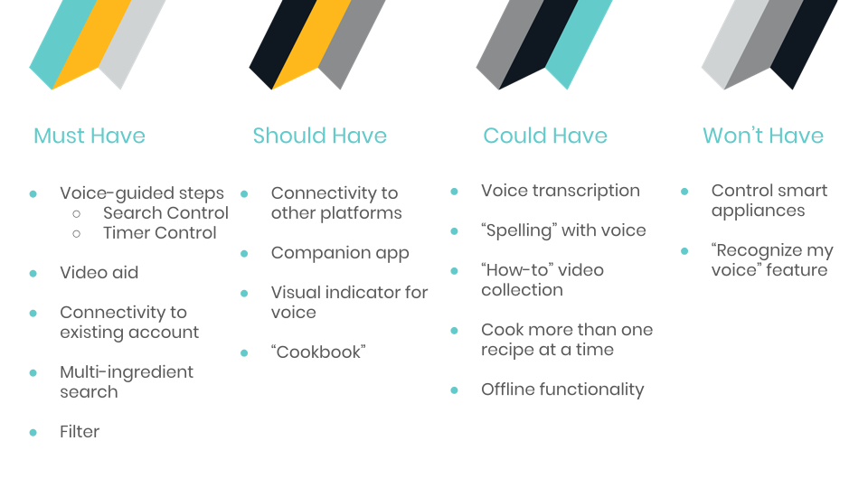
It was necessary to prioritize the flow of the guided cooking steps. The main purpose of the app was to help users cook. So crucial features had to include:
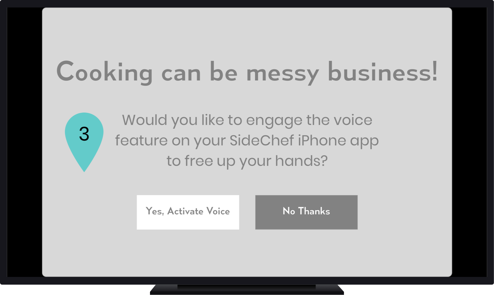
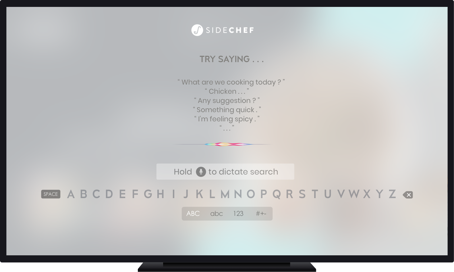
Voice commands for a completely hands-free cooking process.
Instructional videos (most of our users were chefs with little experience) that could be also be queued with voice.
We had originally intended to make the entire site voice interactive - but pivoted to just recipe steps and recipe search in order meet our MVP
Users also had to have the option of completing the steps with the TV remote. This meant compatibility with AppleTV Human Interface Guidelines.

The AppleTV remote requires holding the microphone button to engage voice feature
Designing to accommodate both the existing SideChef platform and AppleTV Human Interface Guidelines
Making necessary information readily available through recipe steps, which means no digging in the middle of cooking
Implementing both a voice and touch interface
So - if the TV remote didn’t allow for a true hands-off experience, how were we going to work around that - build a new remote?
In fact, that’s exactly what we did.
DESIGN

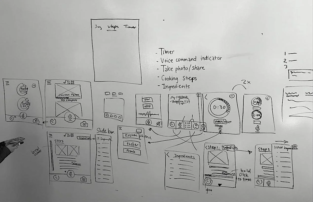
Sketching
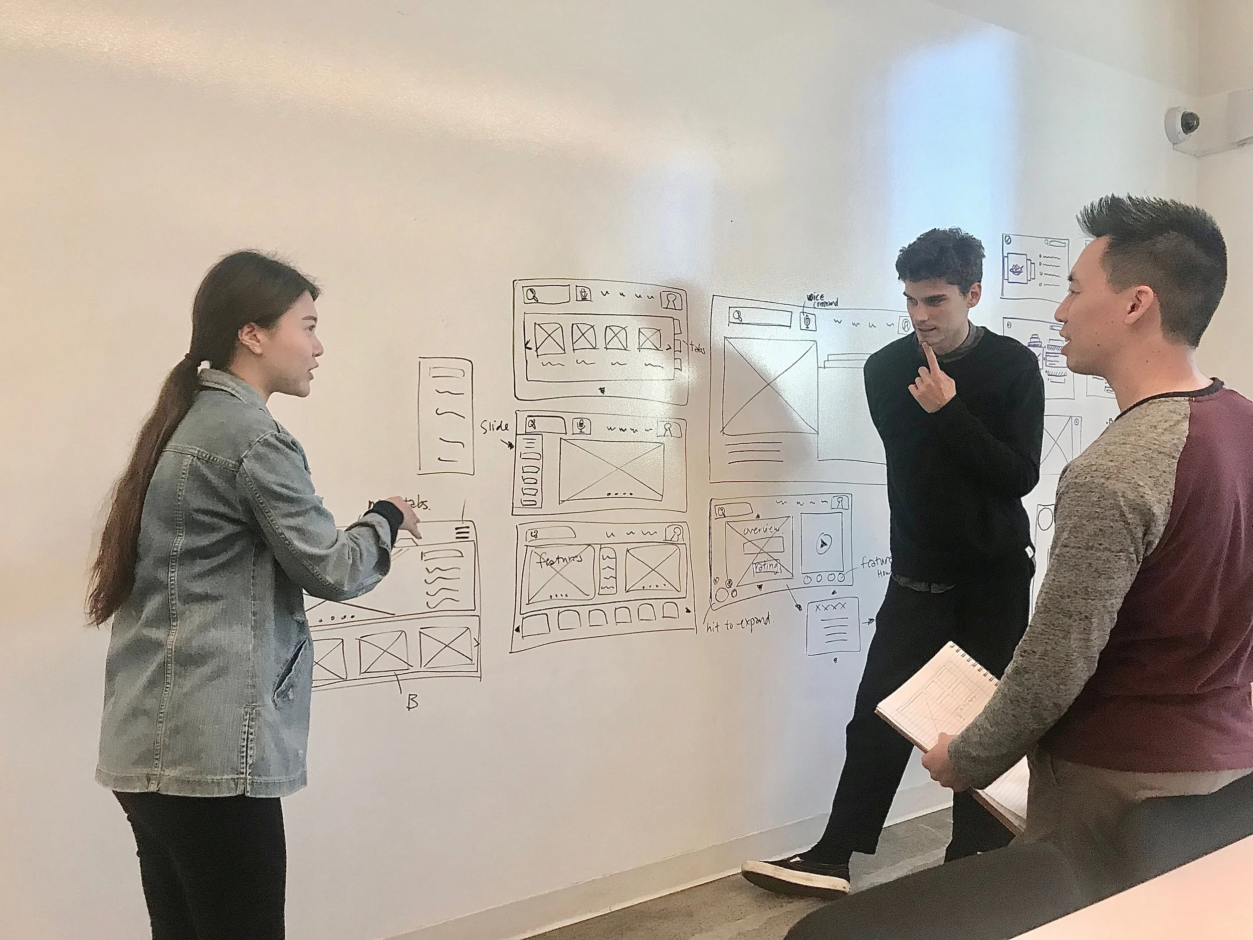

We began by modeling our initial sketches after the existing mobile site with expansion in mind. It meant current users would have familiarity with the layout, but the bigger screen would provide greater accessibility. I ran design studios to make sure the team was on the same page.
Usability Testing
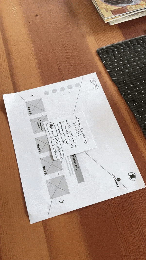
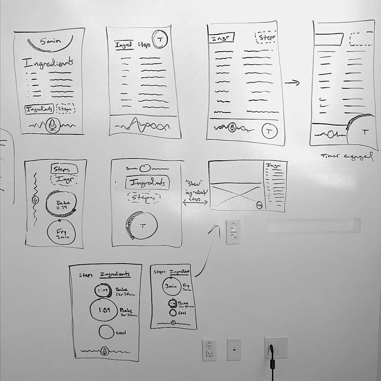
Many changes were made on the fly…
…often pairing more refined low-fidelity mockups with hastily-assembled sketches. This made it easier to iterate and test wireflows rapidly while remaining on task.


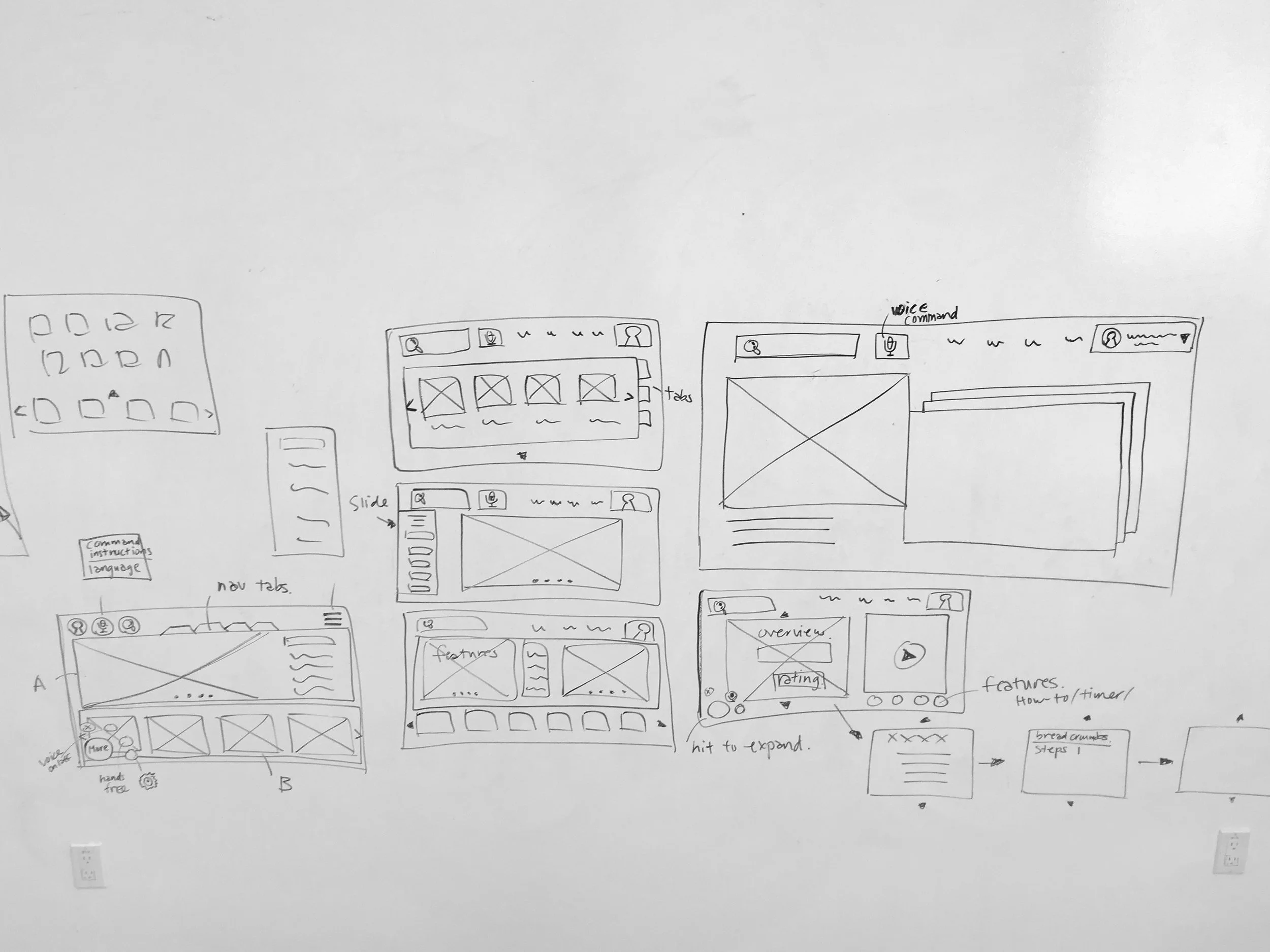
Mid-Fidelity Wireframes
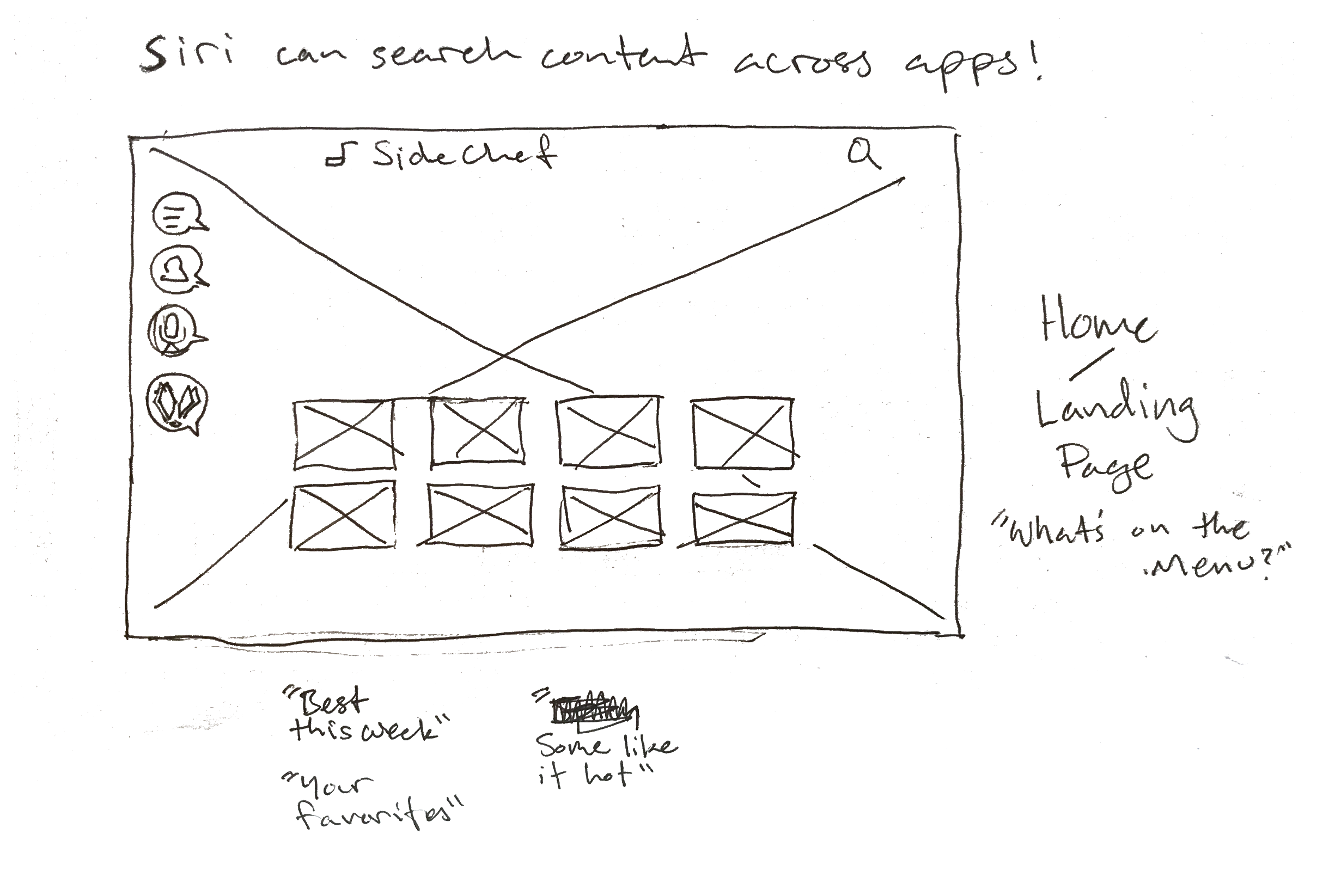
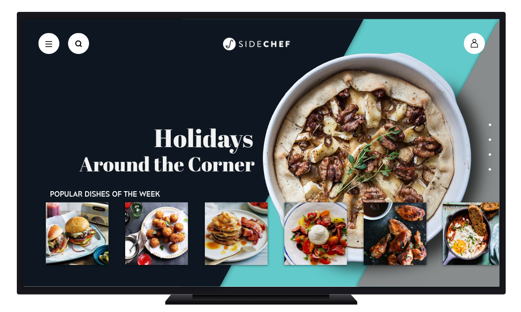
The original plan was to keep the home page as blank as possible, but usability testing showed users needed options for discoverability.
Through several iterations of display and location of primary navigation icons, the home page could be built based on user’s existing mental models and AppleTV user’s experience with the platform.
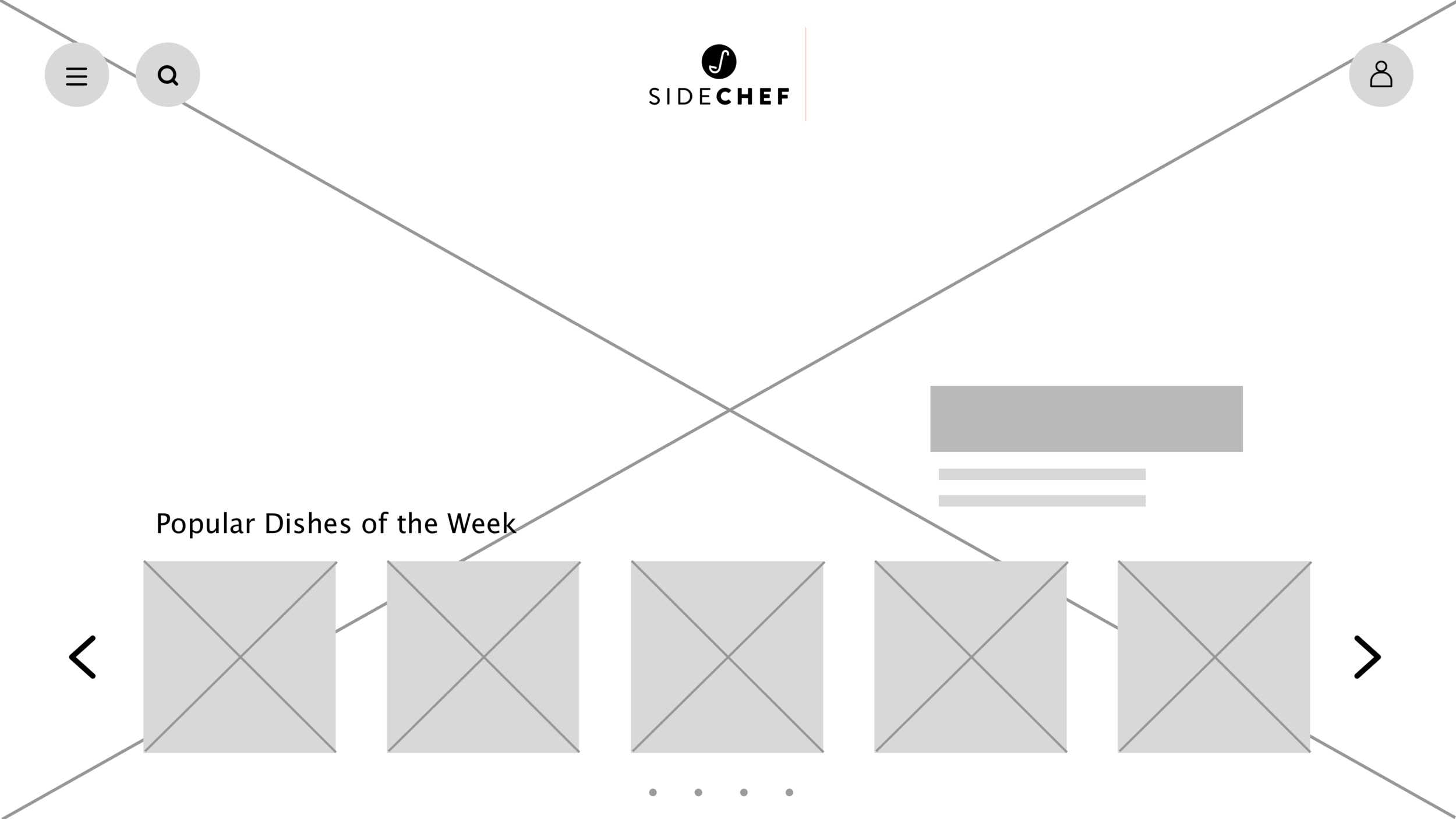
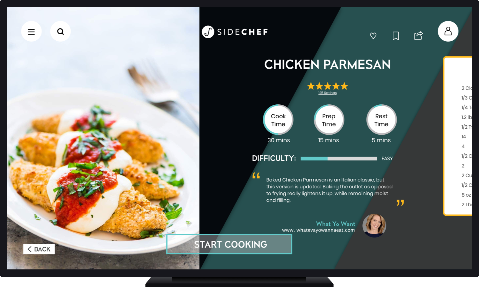
App Home Page
It was necessary to do some experimenting with the placement of different features based off of user interviews and surveys.
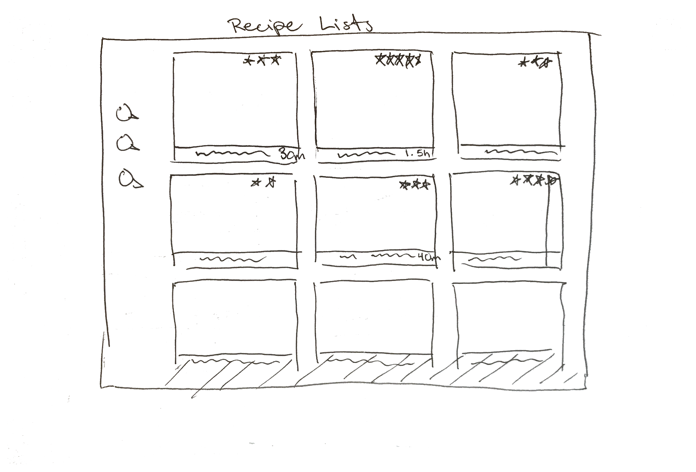
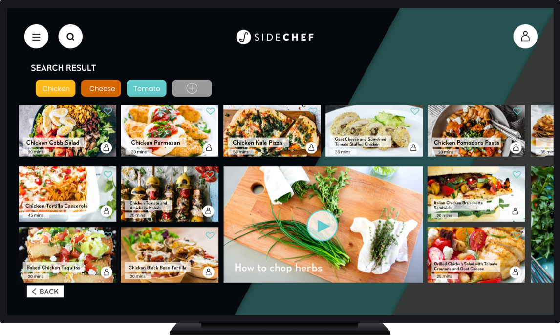
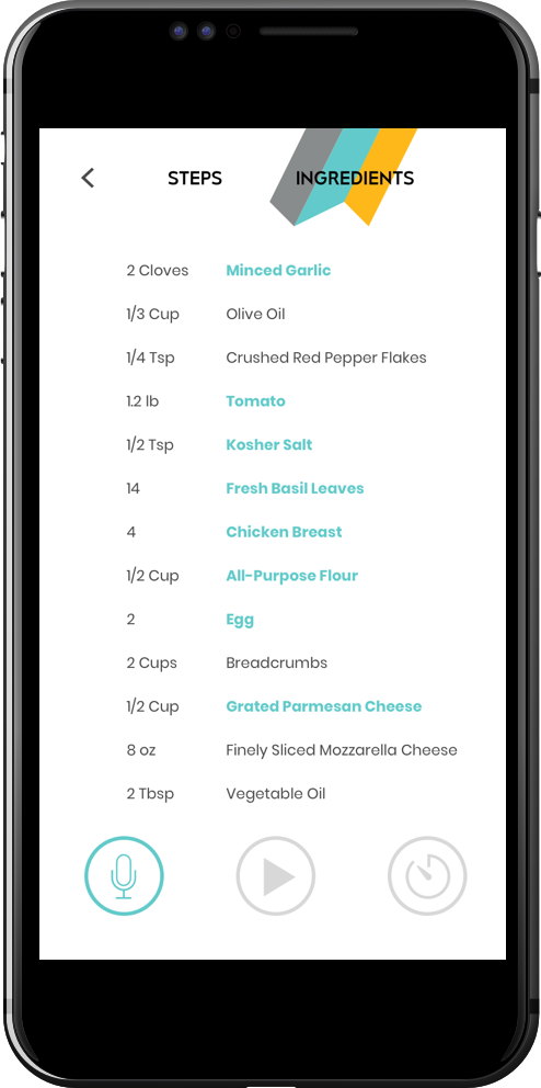
Within the recipe search:

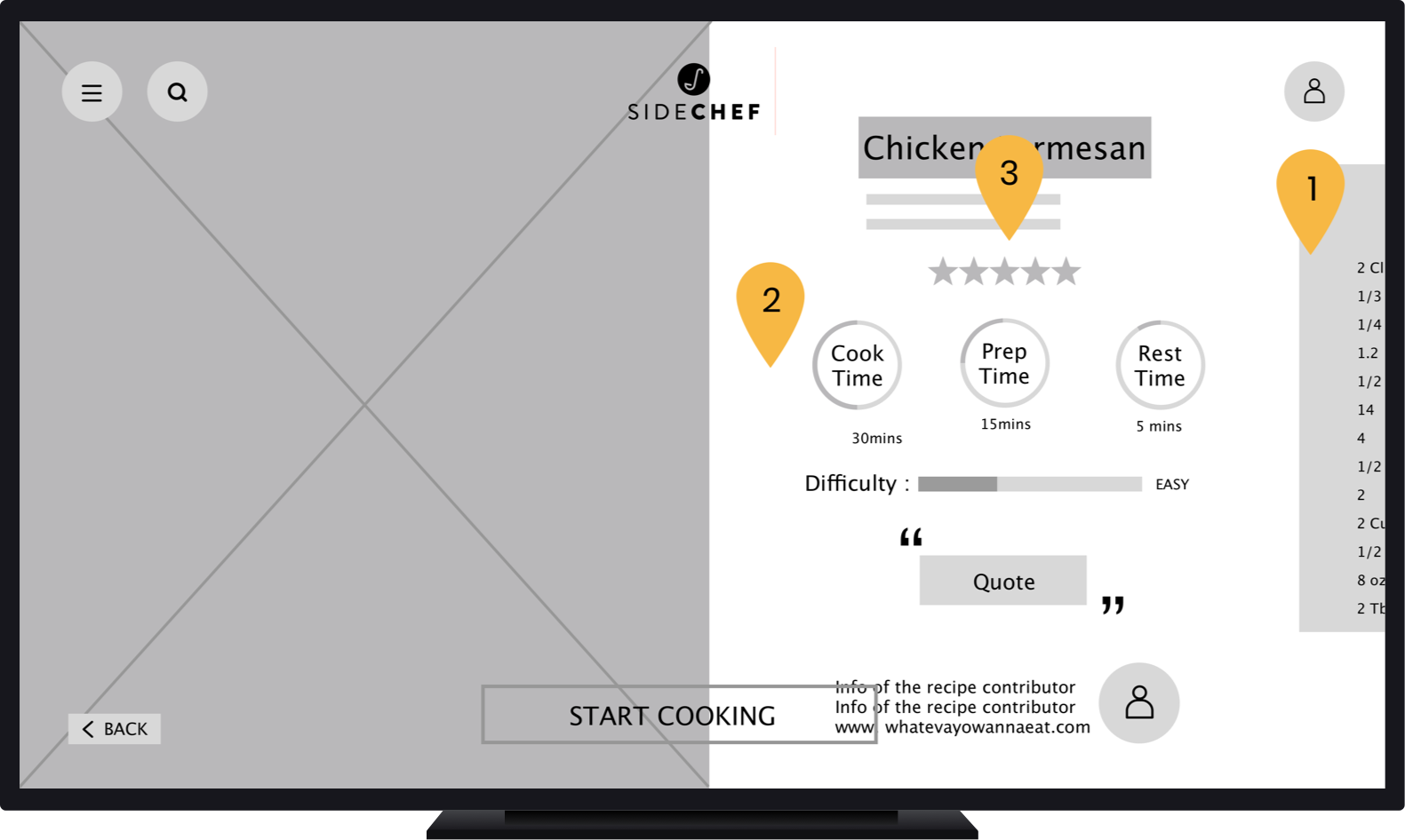
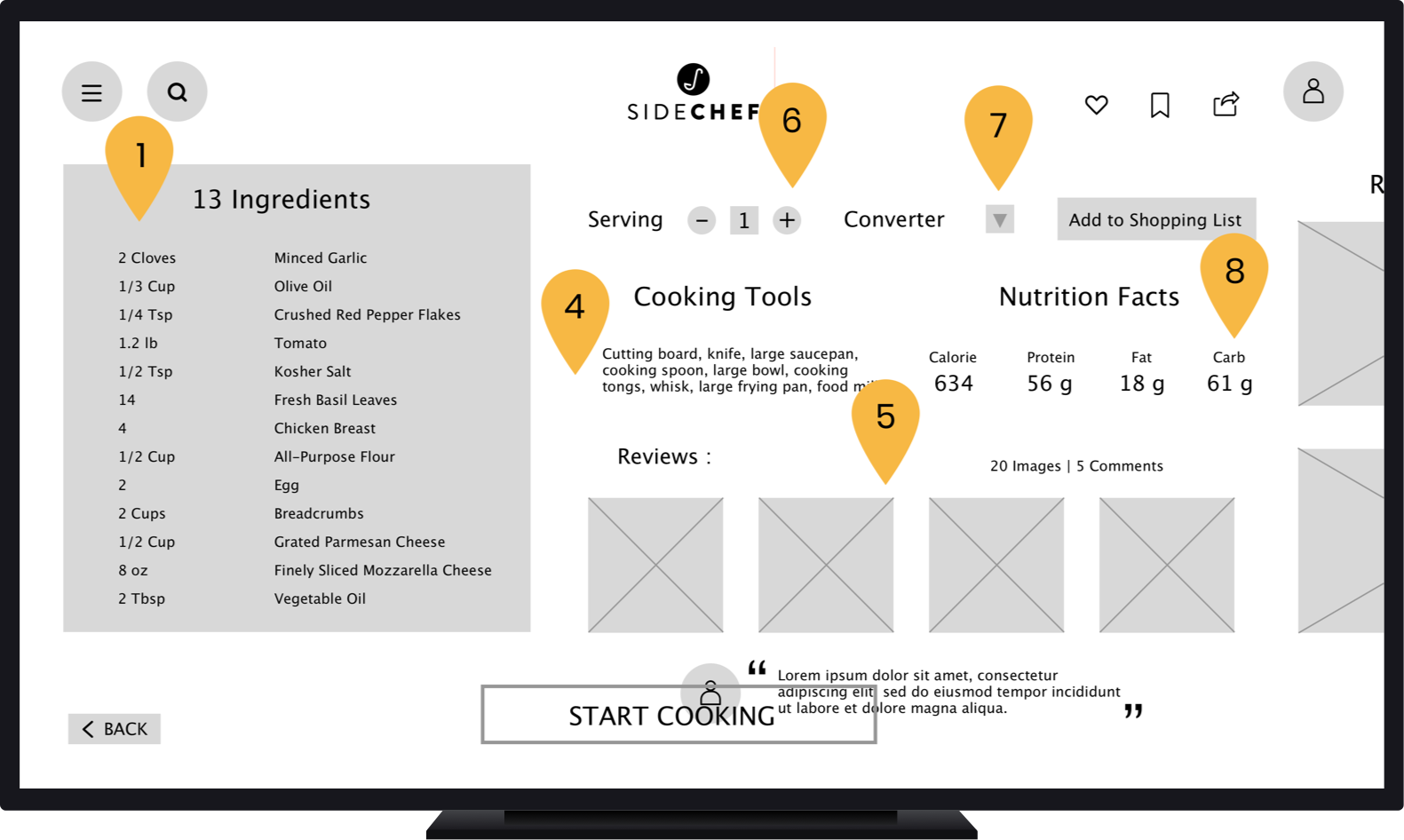
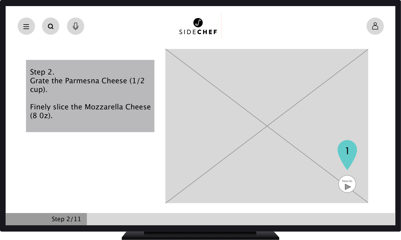
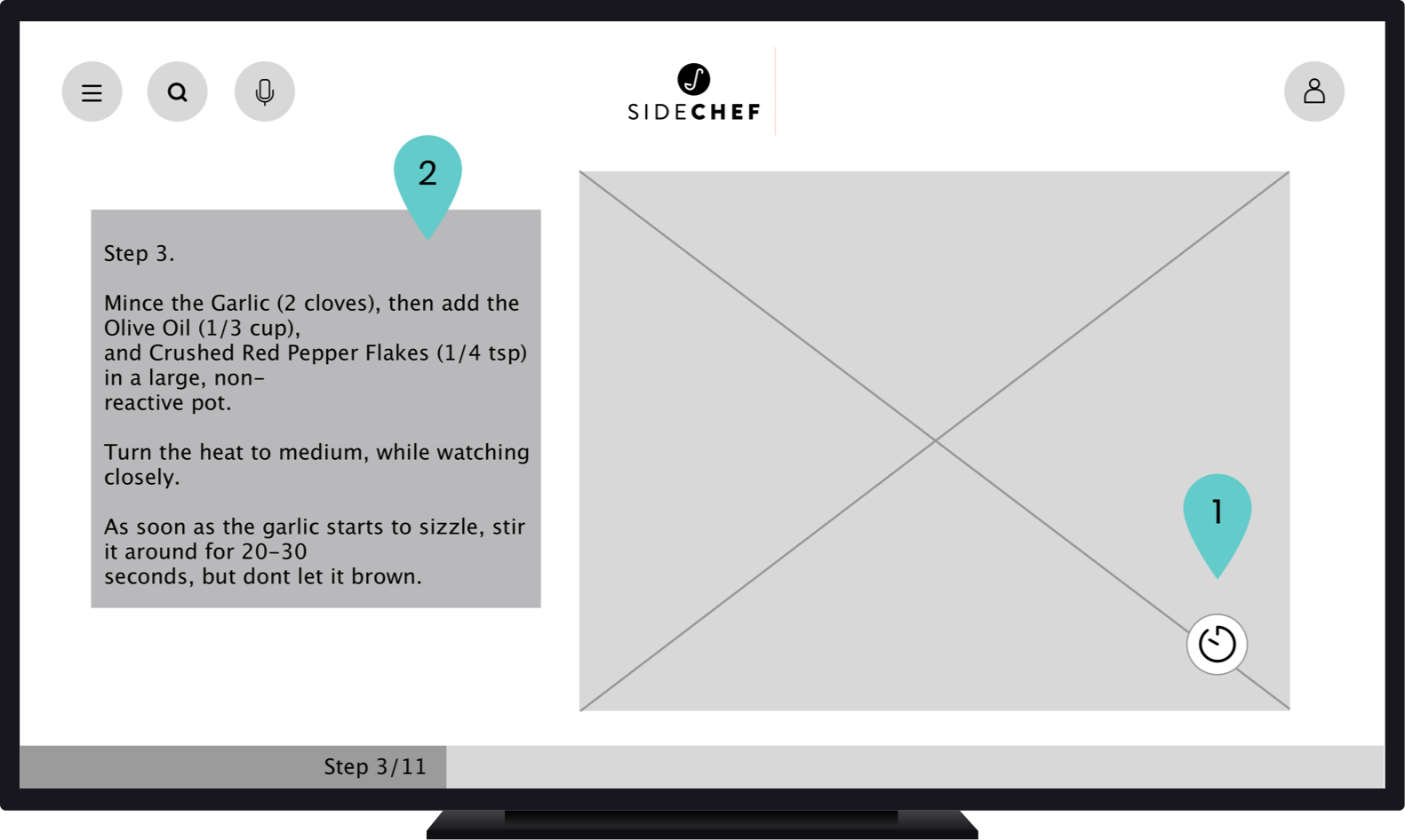
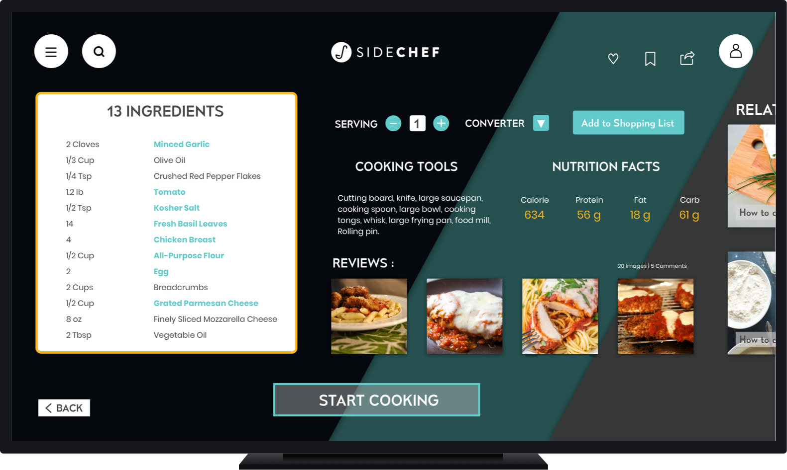
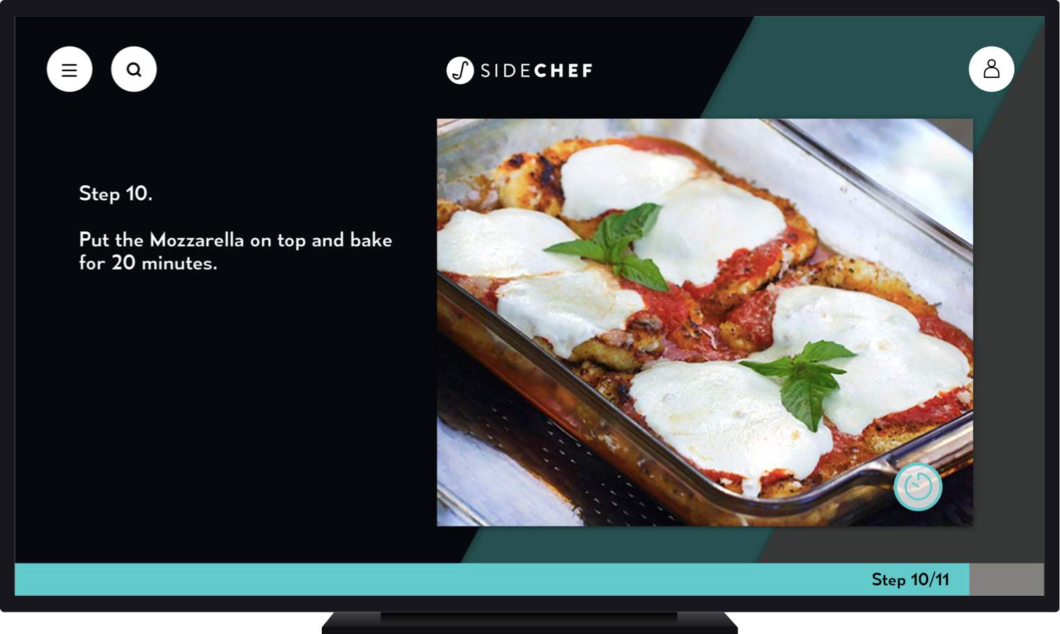
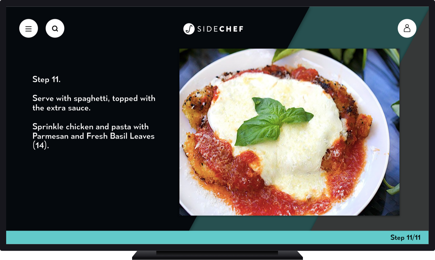
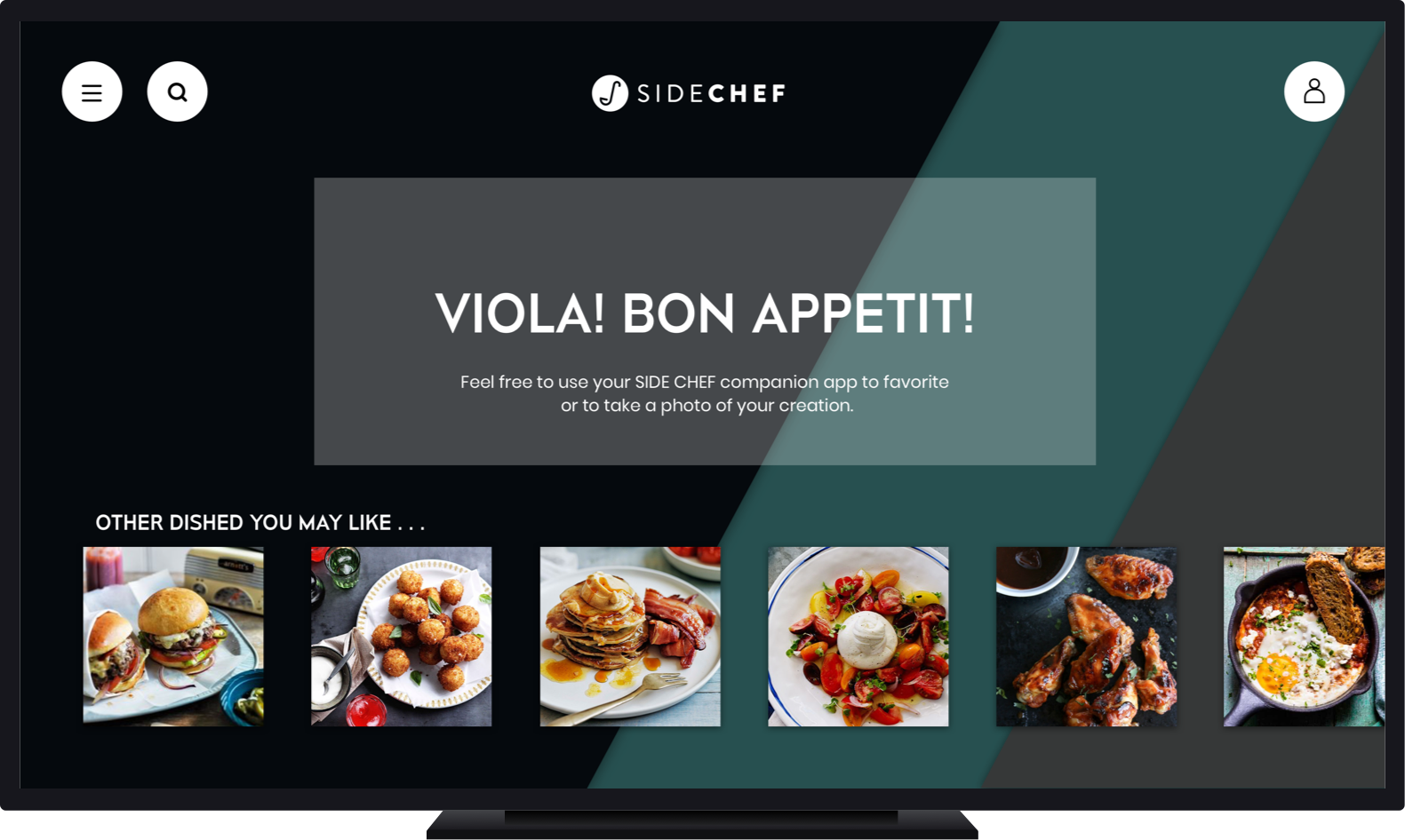
Within the recipe steps:

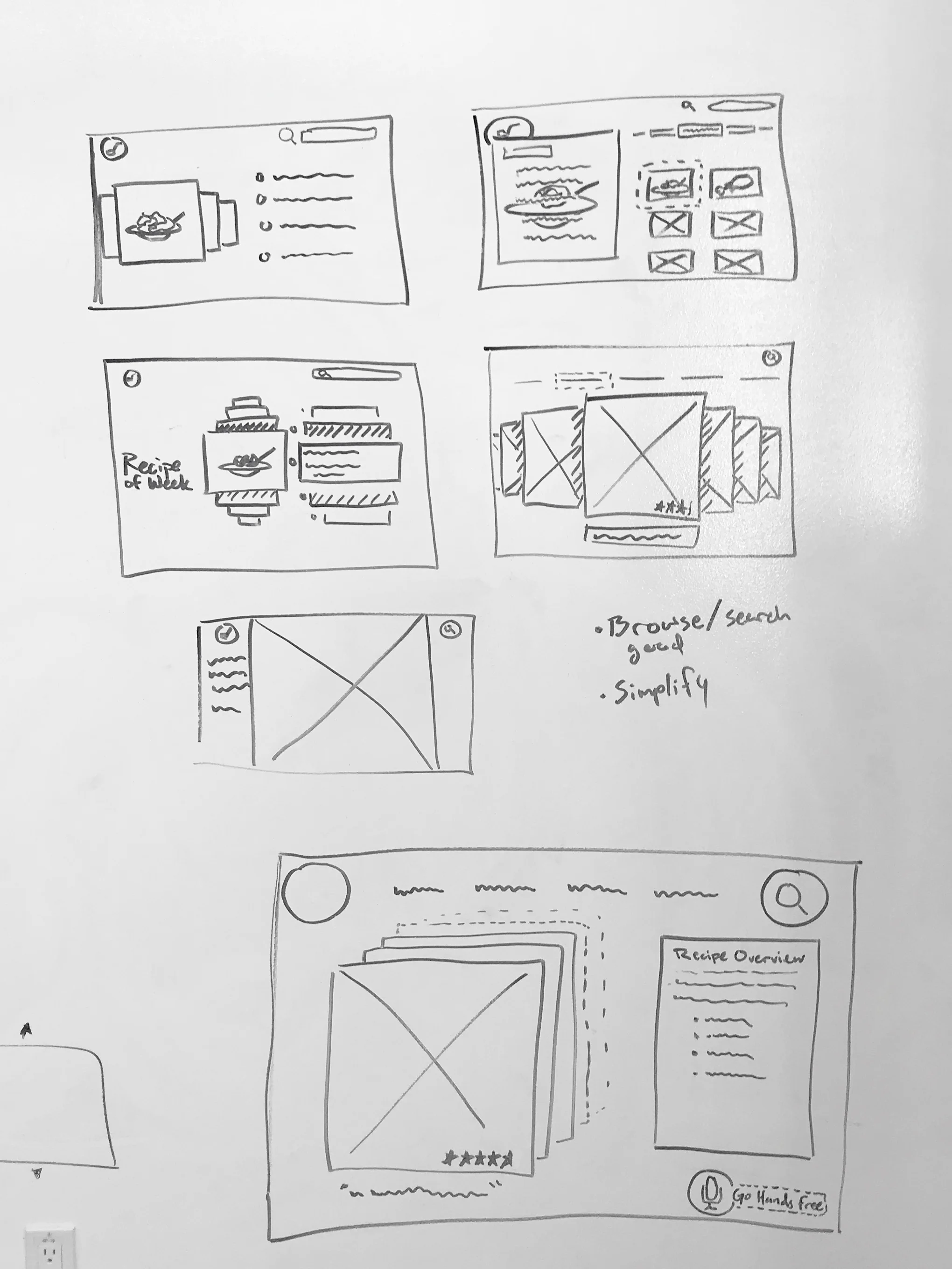
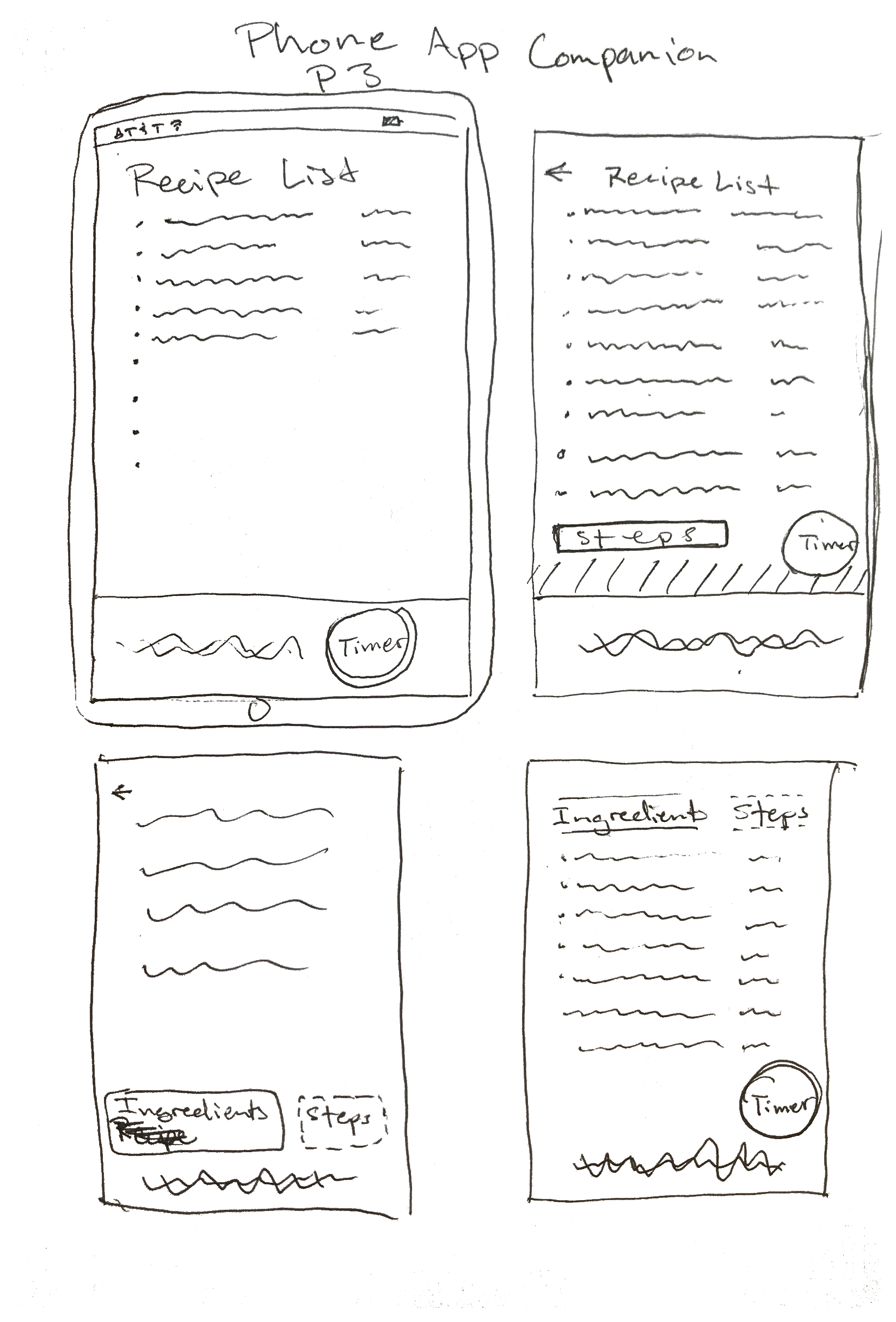
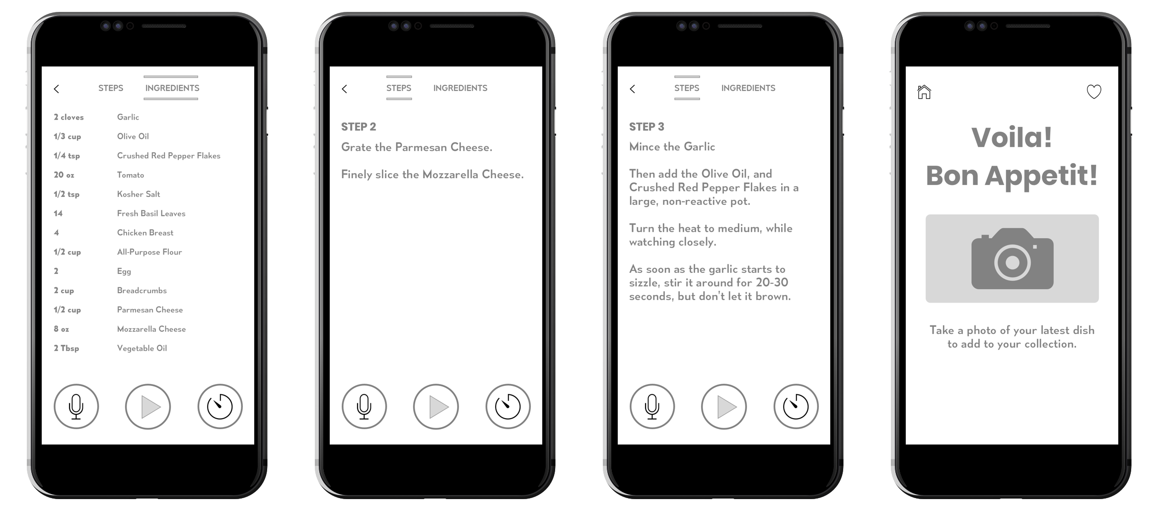
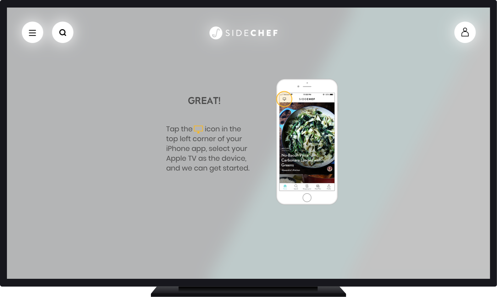
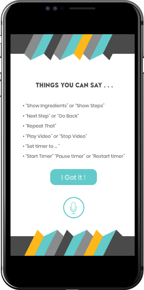
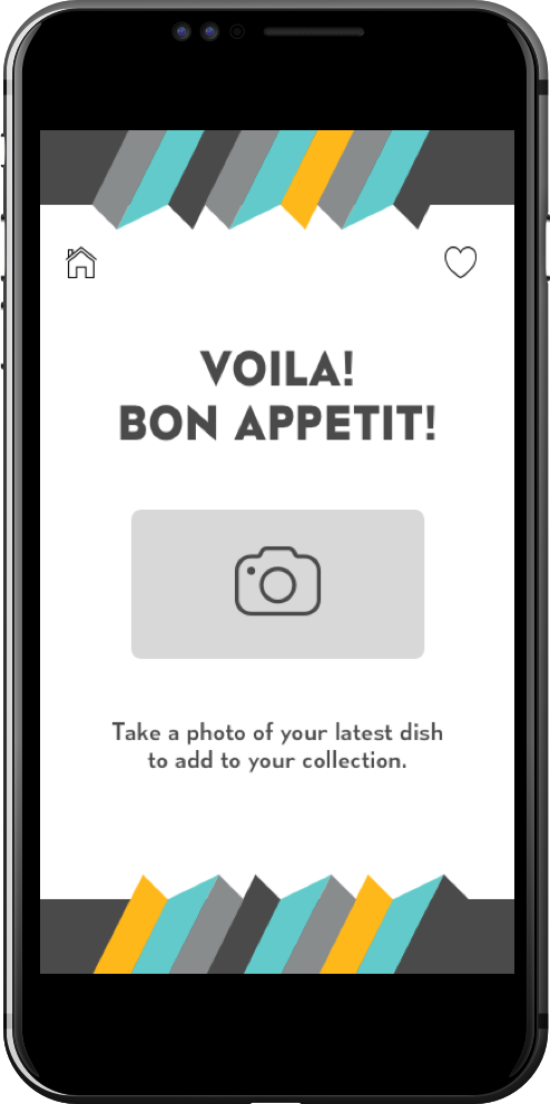
The Smartphone Companion App
Once we had the skeleton of the TV app built up we could start our work on its mobile companion.
This was the solution to working around the Apple TV remote’s limitations. The smartphone gave cooking instructions portability, while the microphone could replace the mic on the remote. The user was no longer required to push a button to speak - creating a truly “hands-off” interaction with the platform.

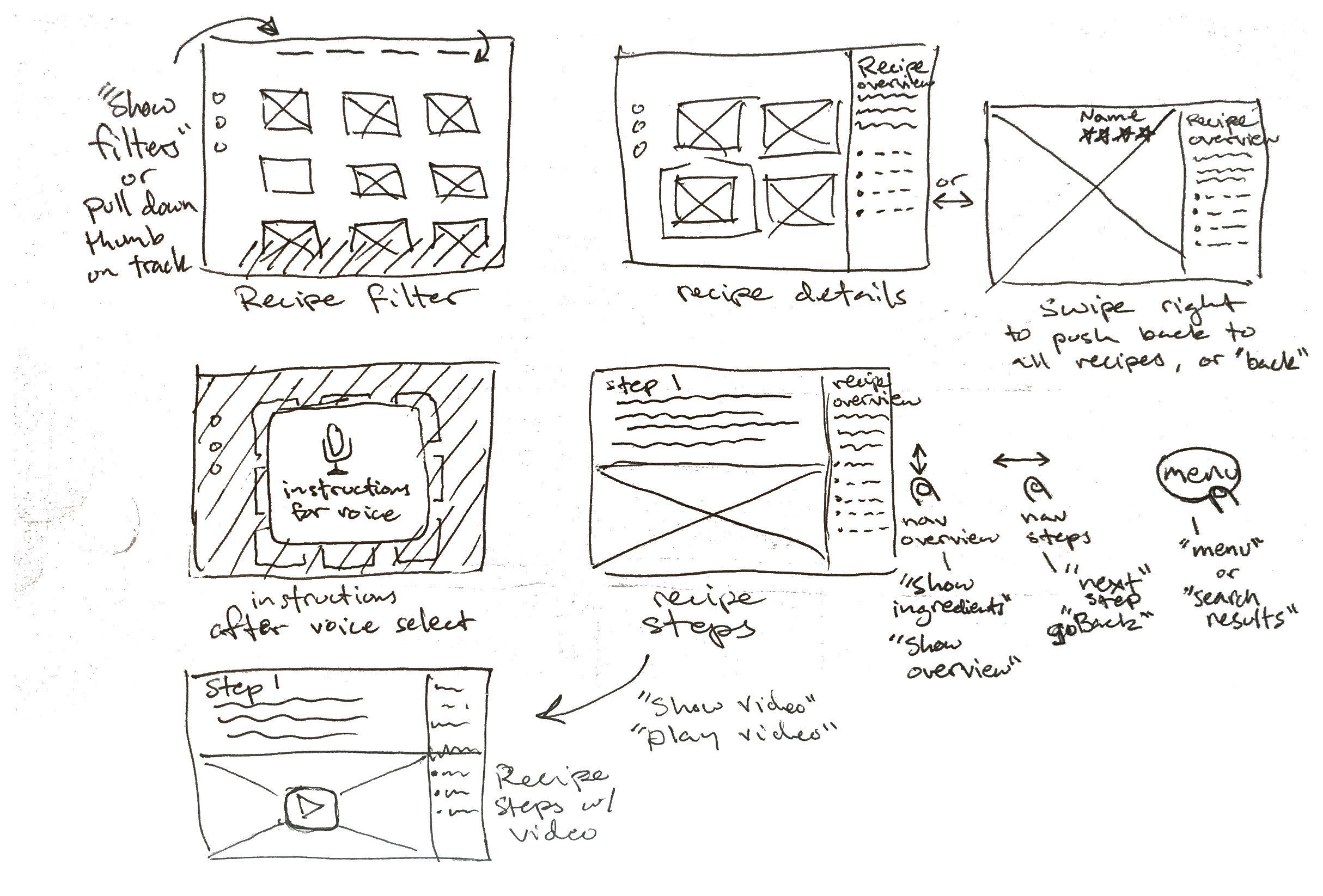
The Final Product


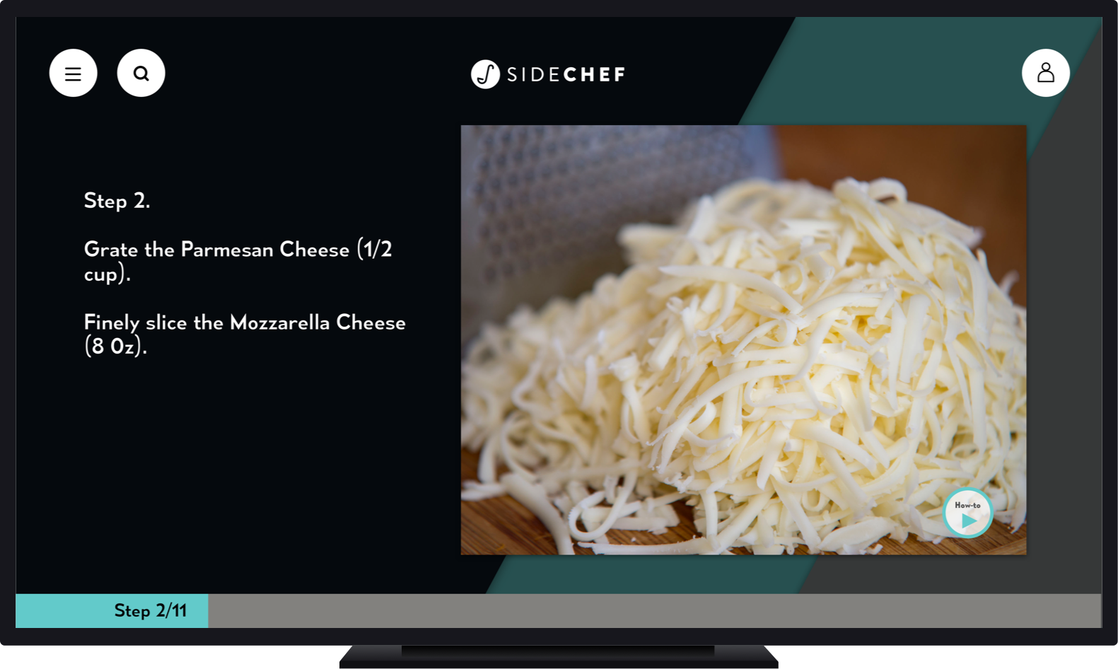
The TV App
The Companion App
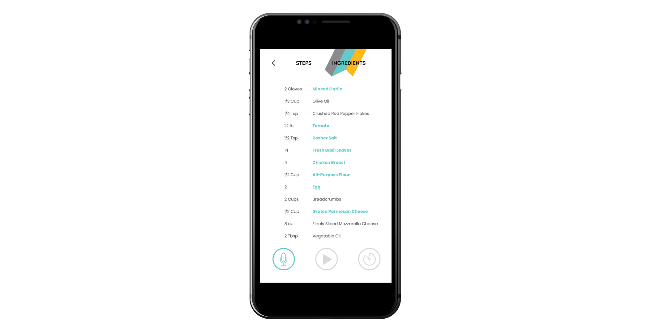
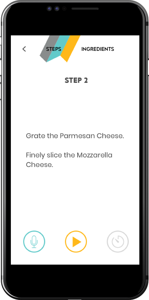
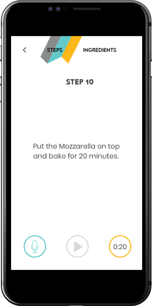
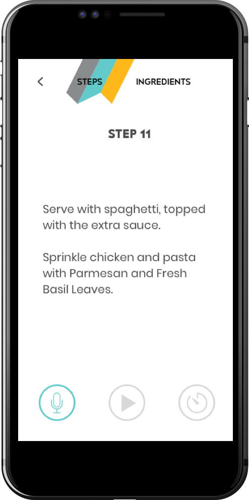
The microphone icon creates a ripple effect when receiving voice commands.
The video and timer icons highlight when the recipe step contains a video or timed element.
PROTOTYPE