LA County Fair
Modal Form Flow For Vendors
Time: 2 weeks
Tools: Sketch, Lucidchart, InVision Studio, Pen & Paper
Responsibilities: Research, Data Synthesis, Sketching, Information Architecture, Usability Testing, Prototyping
The purpose of the study was to first evaluate the fair’s vendor enrollment pathway, then implement a redesign based on my findings. This was not a full site redesign. It was strictly to improve upon the way vendors found and completed the vendor application.
This was a concept project and not sanctioned by the LA County Fair or any of its affiliates.
The LA County Fair is the fourth largest county fair in the country, with over 1.3 million visitors each year. It hosts a wide variety of food and commercial vendors each season with a host of diverse products and needs.
The theme this year is Route 66 and the open road.
Through Interviews I found vendors preferred online forms and were more likely to return to the fair if they felt it was a warm and welcoming environment.
Likes:
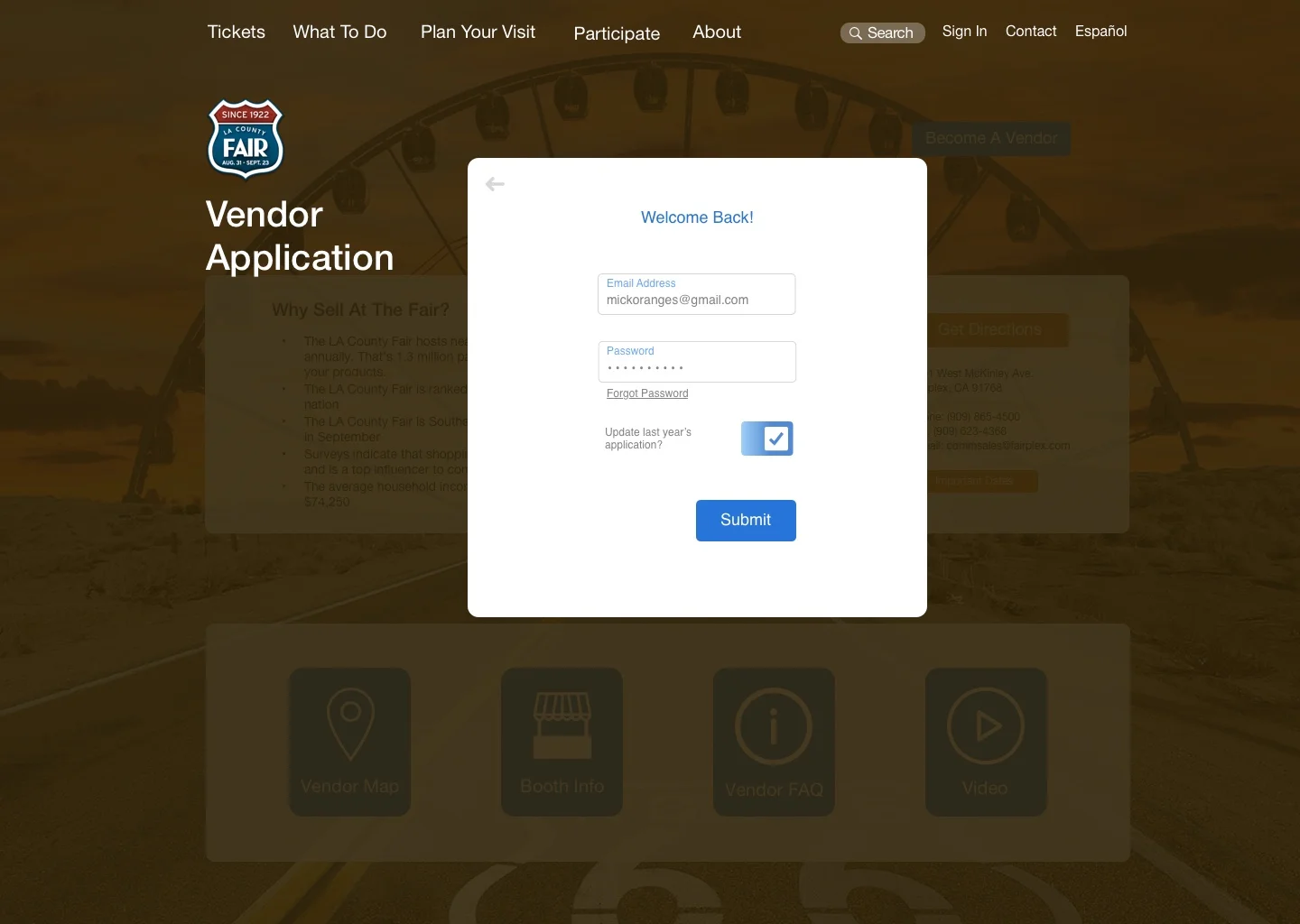
Saved information from previous year if returning vendor
30 minutes max to complete
Forms contained on one page
Dislikes:
Long forms
Entering the same information multiple times
Incorrect estimation of time to complete task
Users between 26 & 56 years of age were told to navigate from the home page through the vendor form. This created a gauge of how the task would appear to new applicants.
Combined with a heuristic analysis the two main problems revealed themselves to be application itself, but also the pathway to the application.

Hierarchy of information reduces clarity.
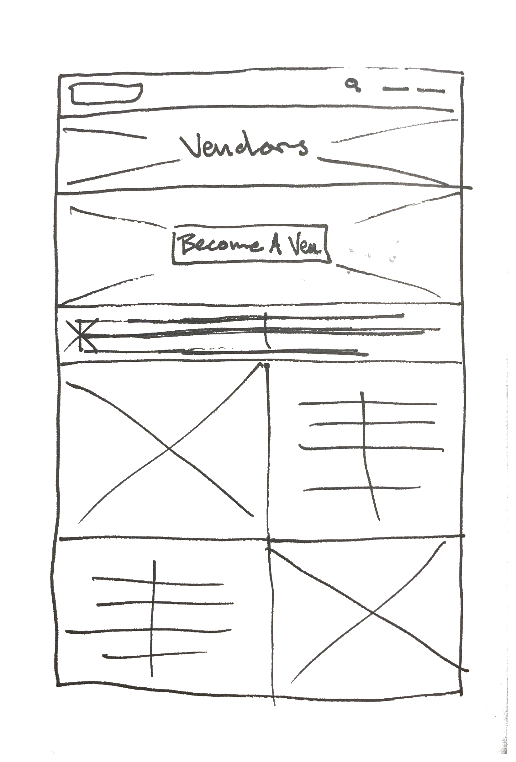
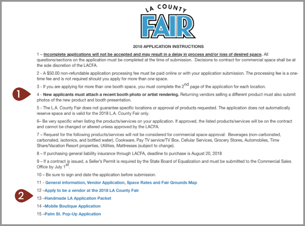
The different forms are unorganized, path to online application is hidden within .pdf forms.

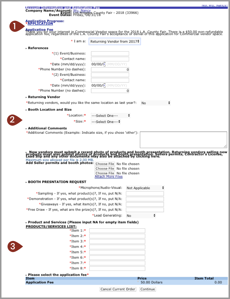
Not a different application. This link just reloads the same form.
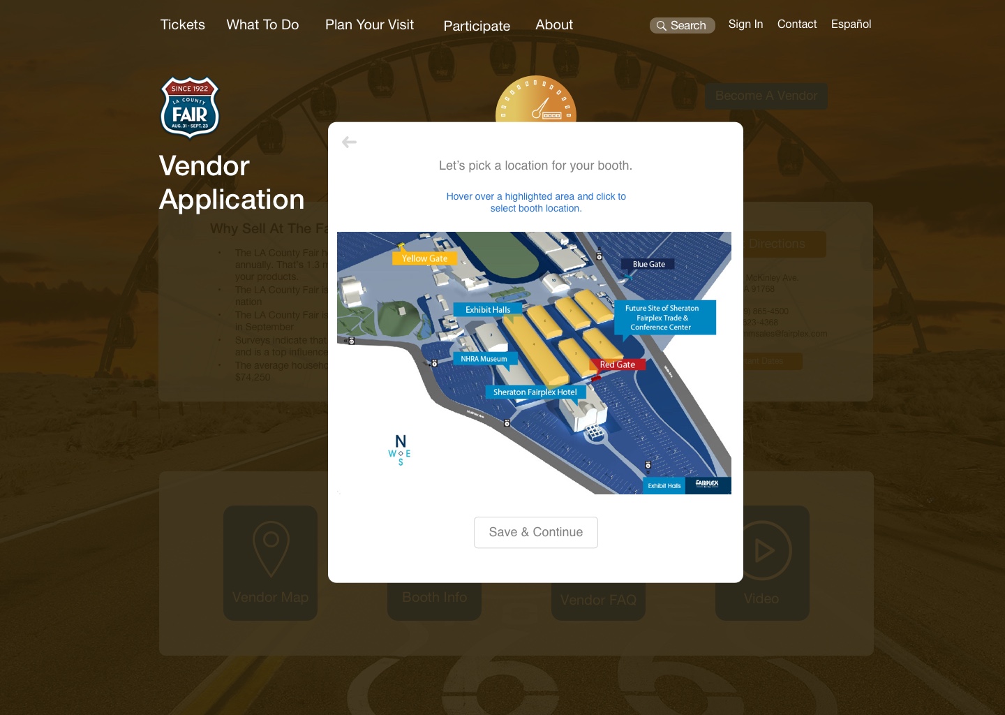
This is just a drop down menu. Users have to backtrack to reference map info.
Must make 8 entries, even if only selling one item. No option to add more than 8 if necessary.
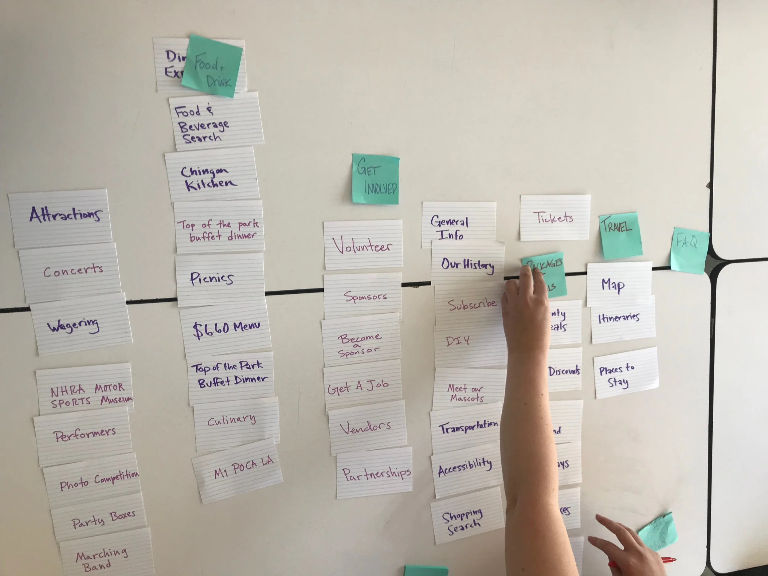
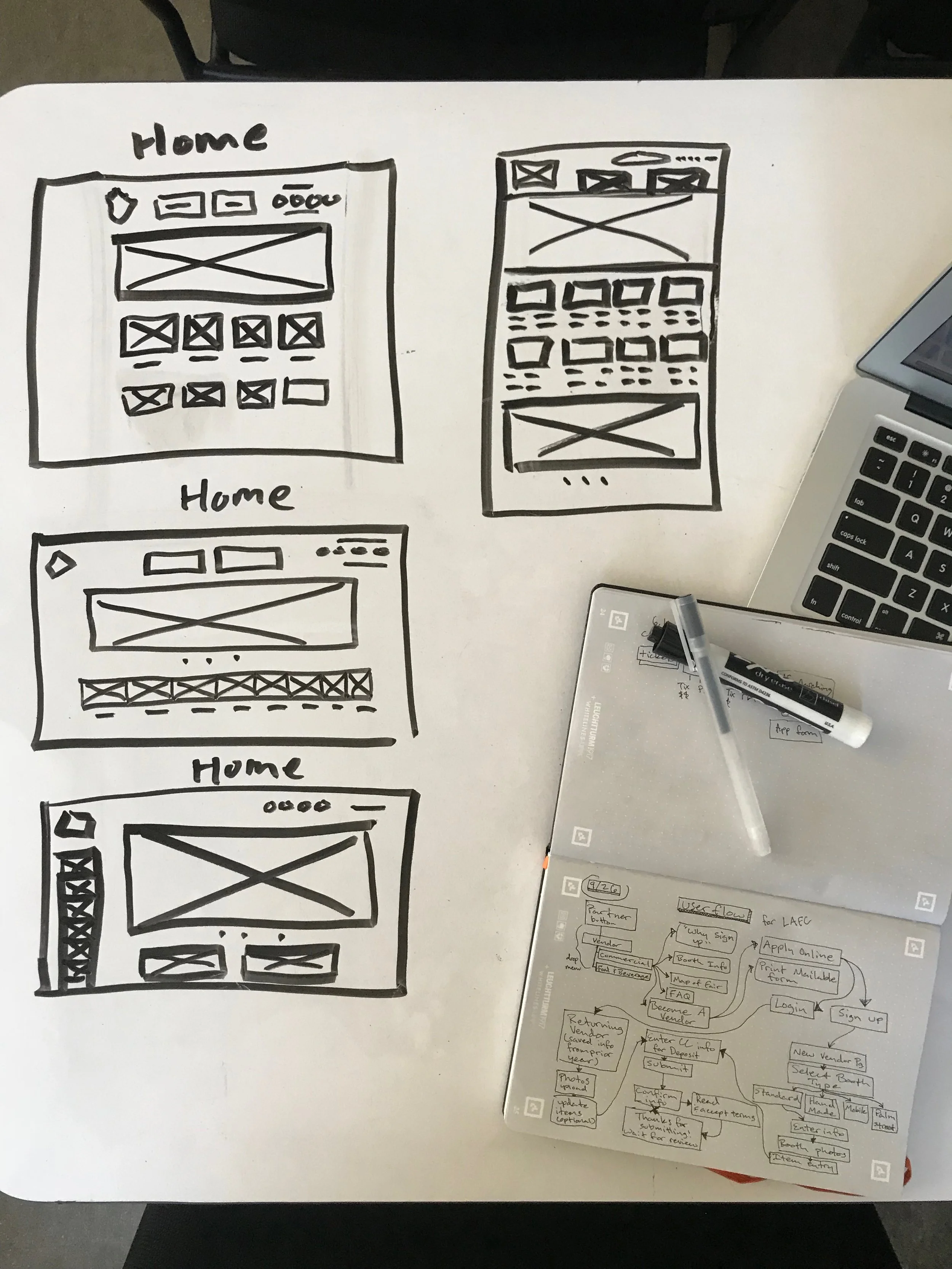
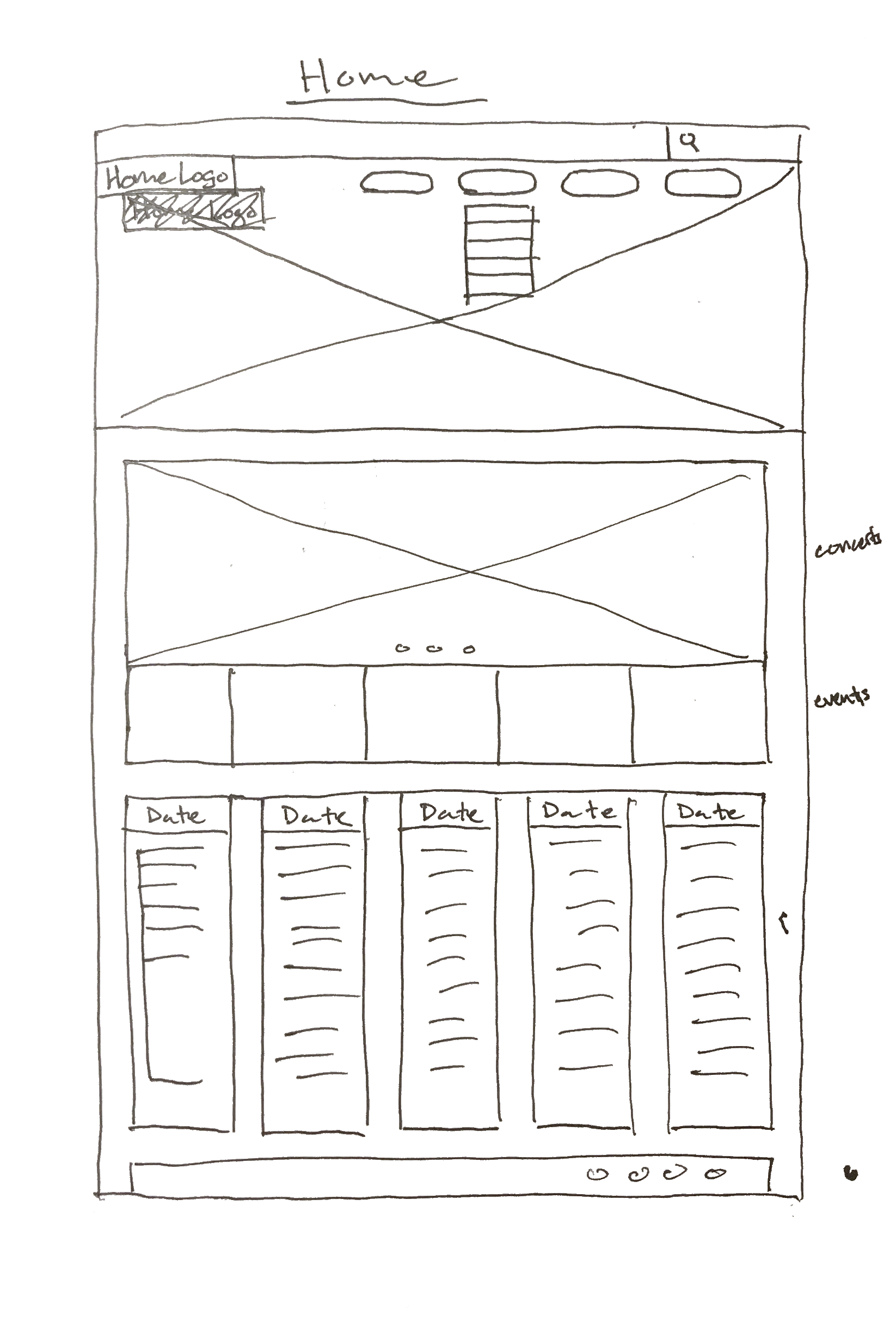
Open card sorting helped to evaluate the primary and secondary navigation of the home page to see how it could be organized better, with users’ expectations and existing mental models as a base.
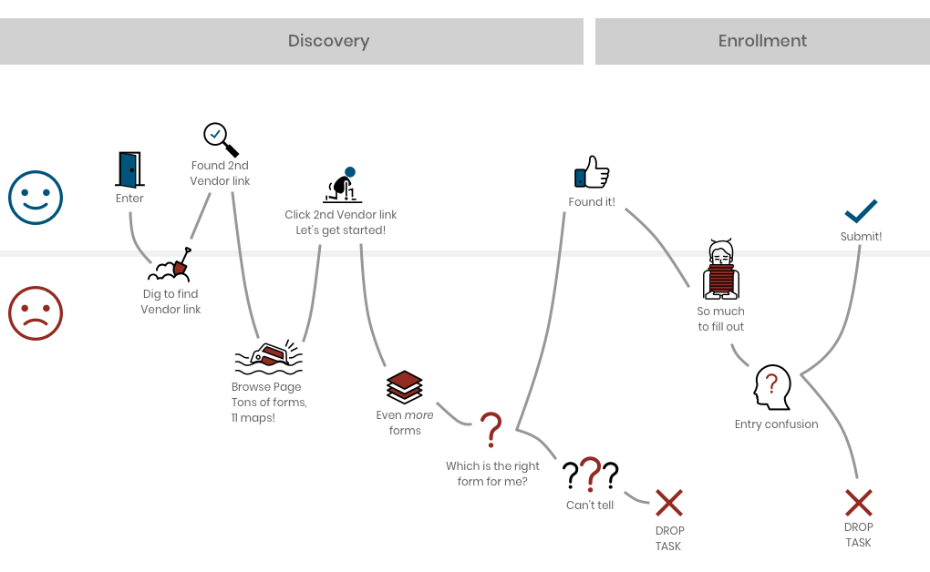
The user’s journey as it stands now.
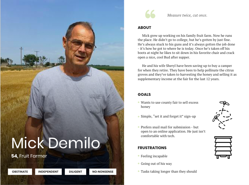
Mick was conceived to set the baseline expectation of use. If Mick can get through the online process easily, then it will presumably be much easier to involve someone who is more tech-savvy.
Help Mick submit his application comfortably online, while still keeping it in a format that is easy to understand.
If it’s easy for Mick - it’s easy for everybody!
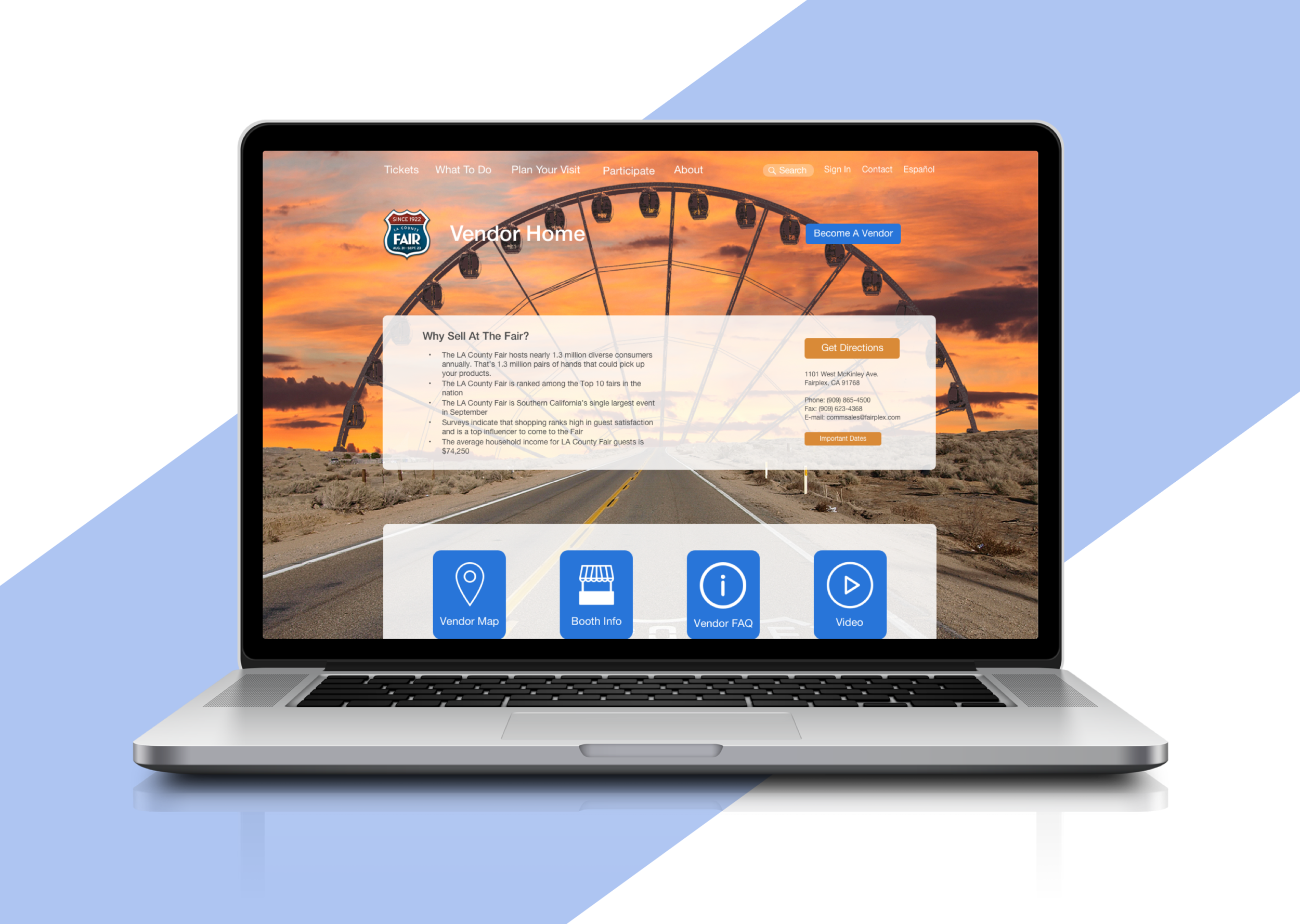
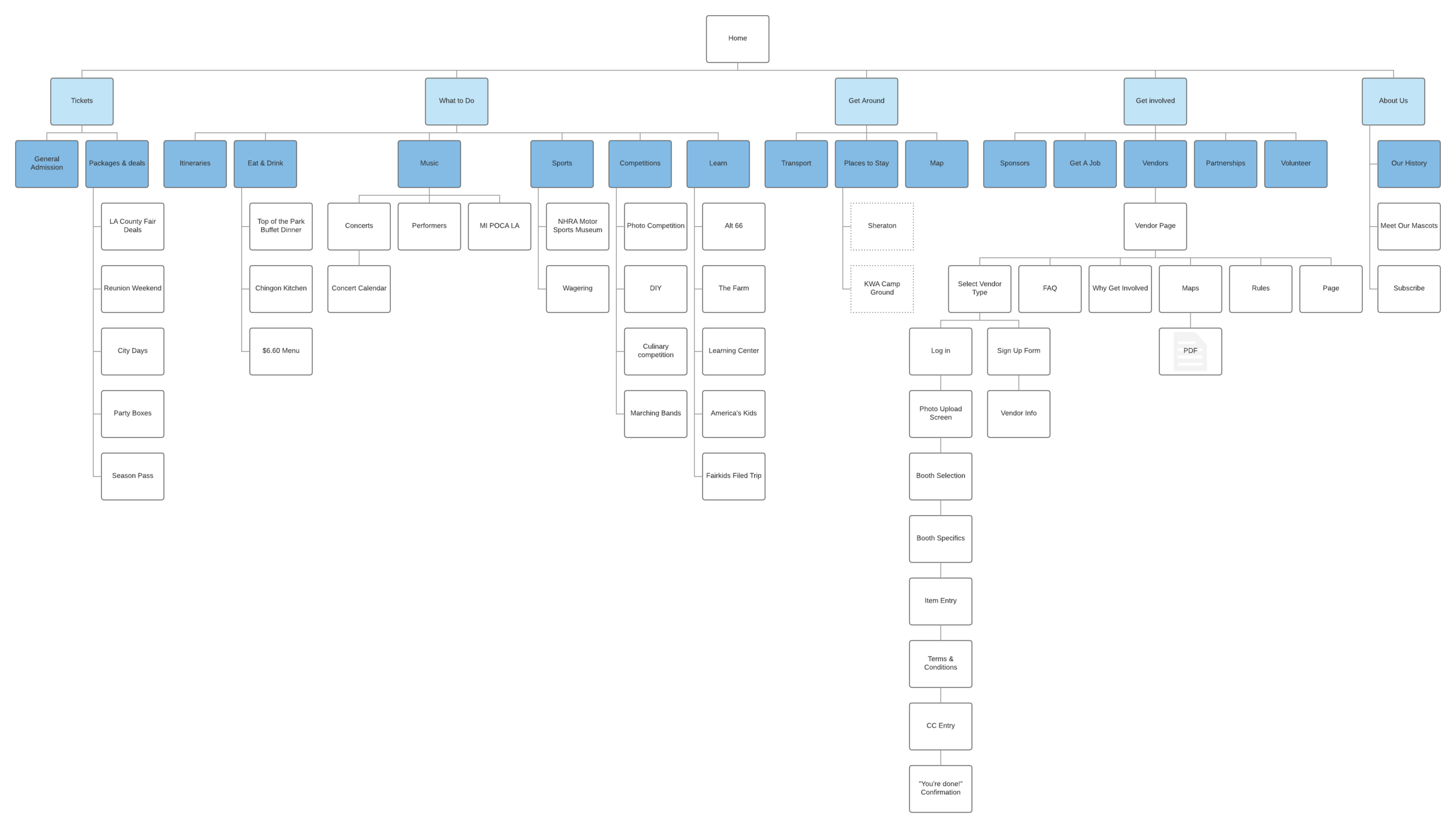
When signing up to become a vendor on the original site it was easy to get bogged down and discouraged by all the information and unclear pathways.
The original site offered access to too much information too quickly, evidenced by the breadth of the above sitemap. Feel free to take a closer look.
After using the information gathered from card sorting I developed a new map, show below. The new map runs deeper but distributes information in a more palatable manner.
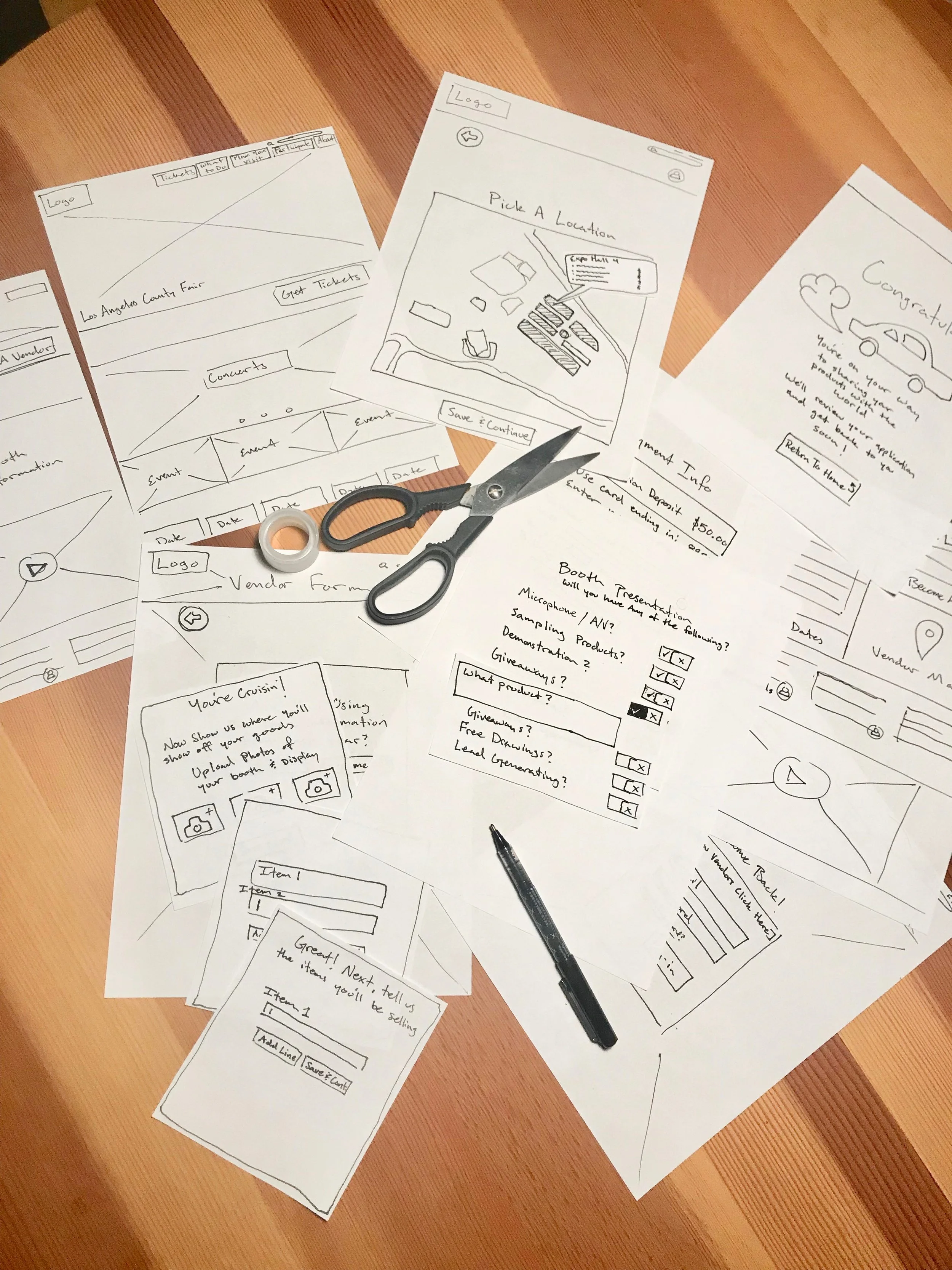
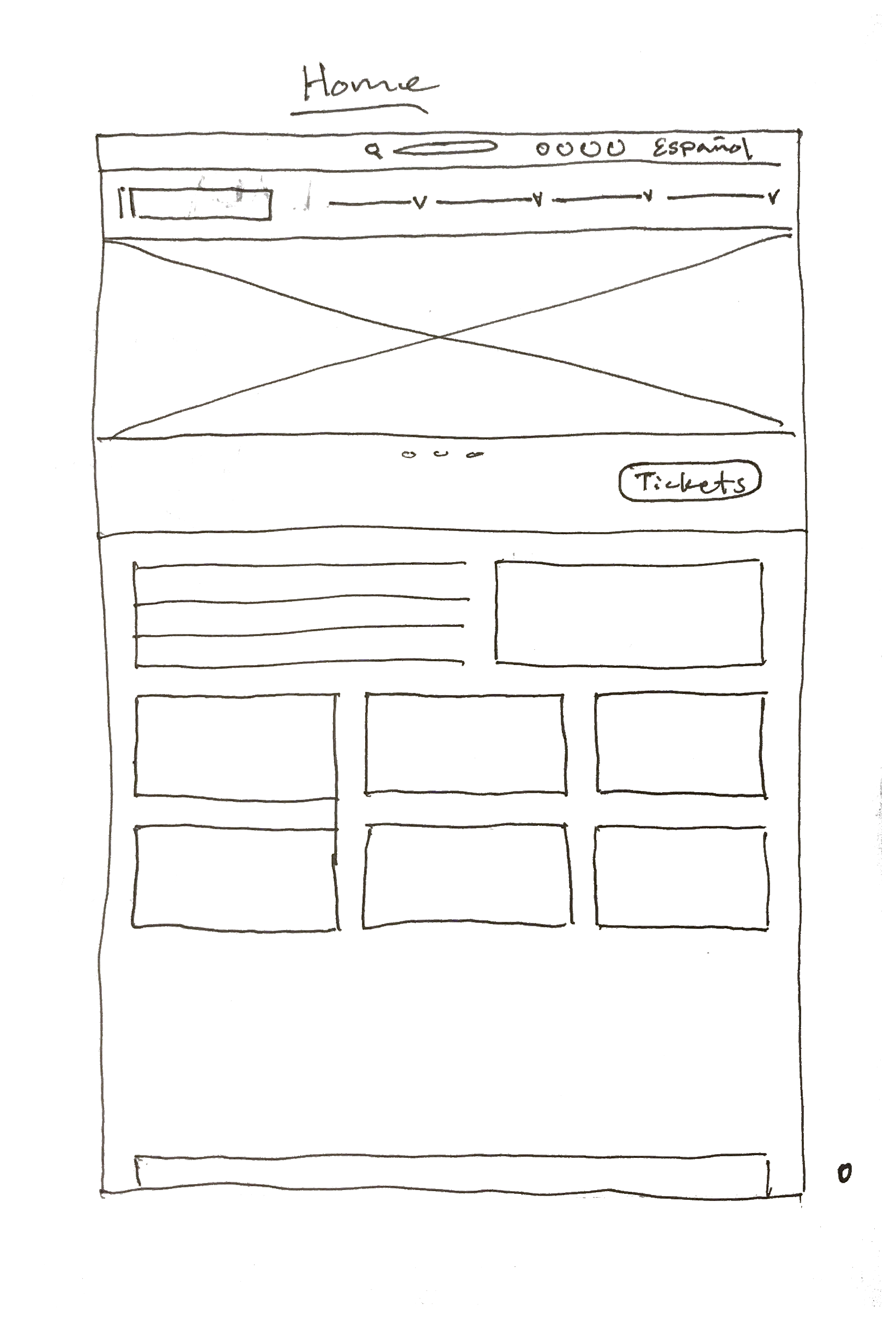
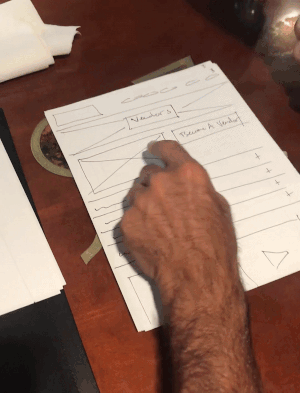
First I tested for discoverability and accessibility. Because of time constraints I used sketches to iterate and test ideas quickly, refining as I went along.
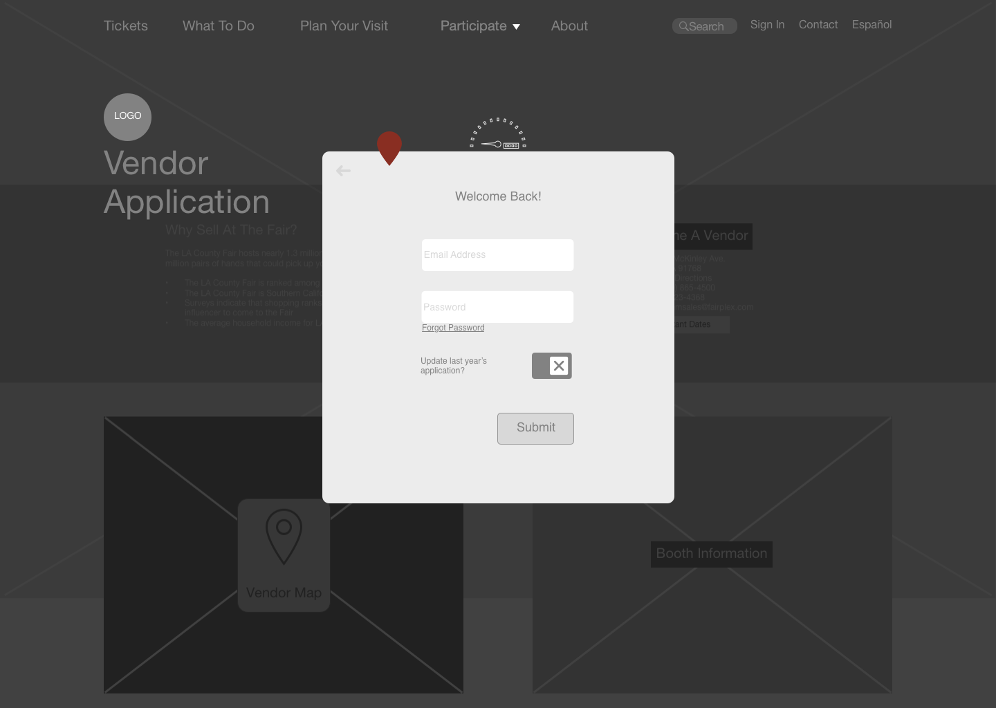
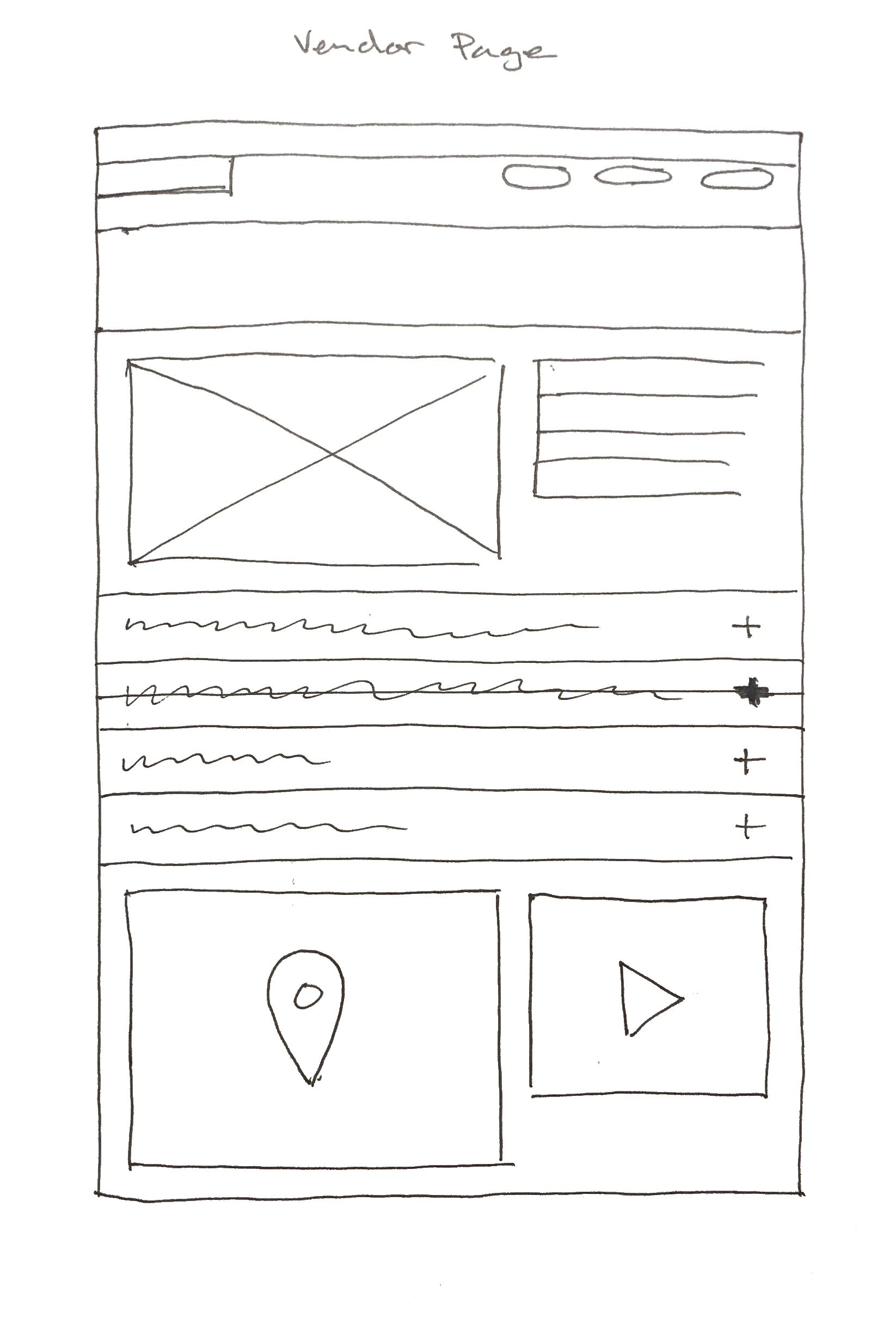
Modal overlays broke up the length of the form. This allowed the user to stay connected to the main site and kept them from becoming overloaded by too much too quickly.
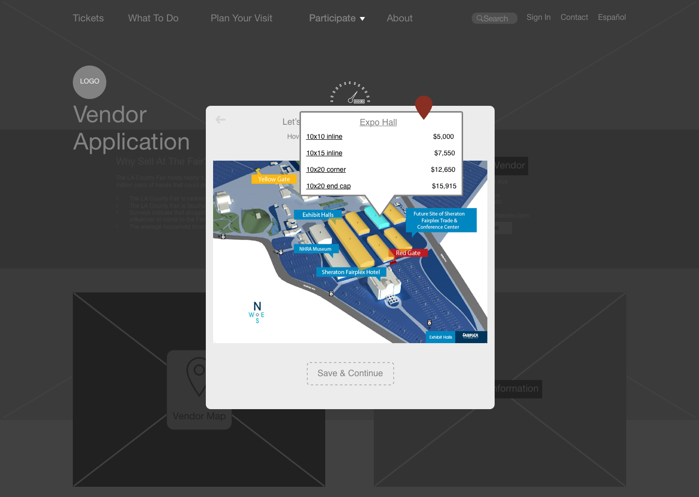
• Booth information made available in a more understandable schematic. Location, dimensions, and prices are all available in one place.
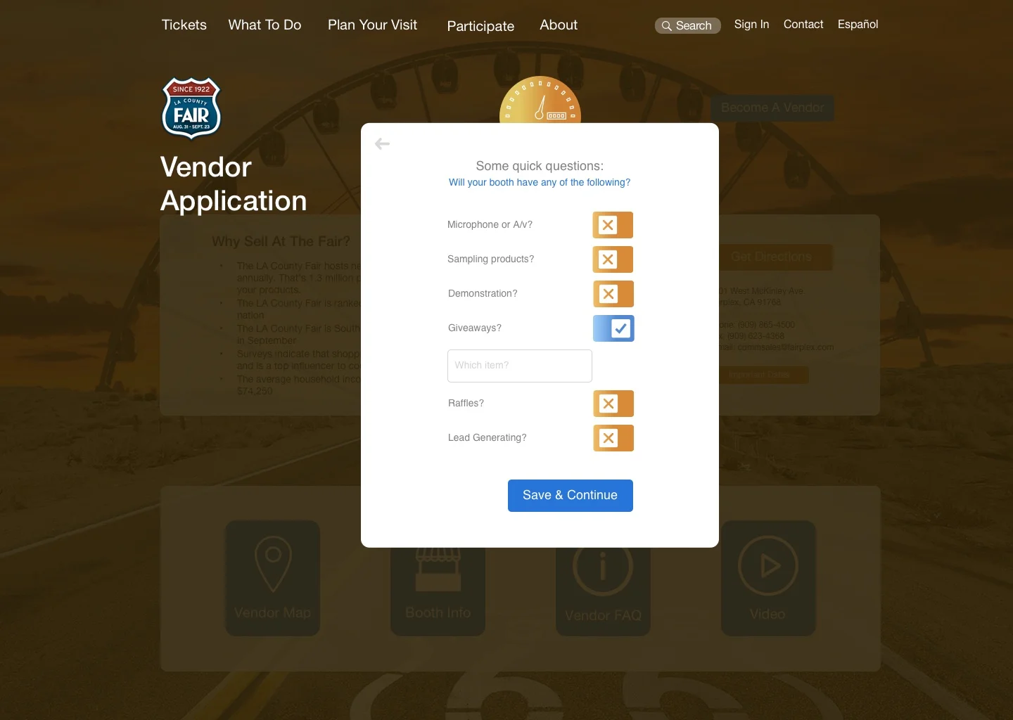
• Using a speedometer as a breadcrumb allowed users to track their progress with on-brand iconography.
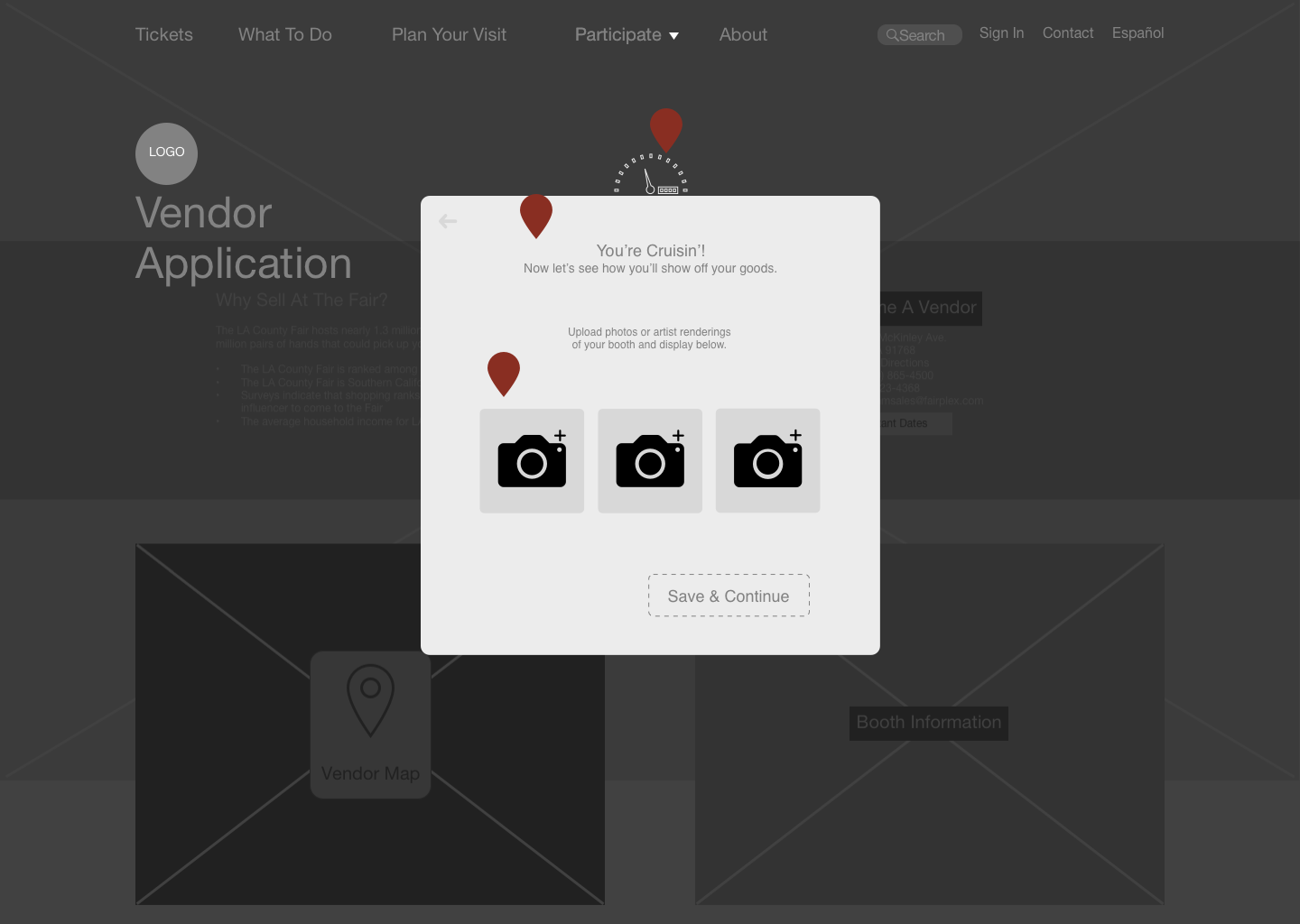
• Fully understanding that the length of the form could be tiring, I added positive reinforcement with microcopy, keeping users on task and feeling good.
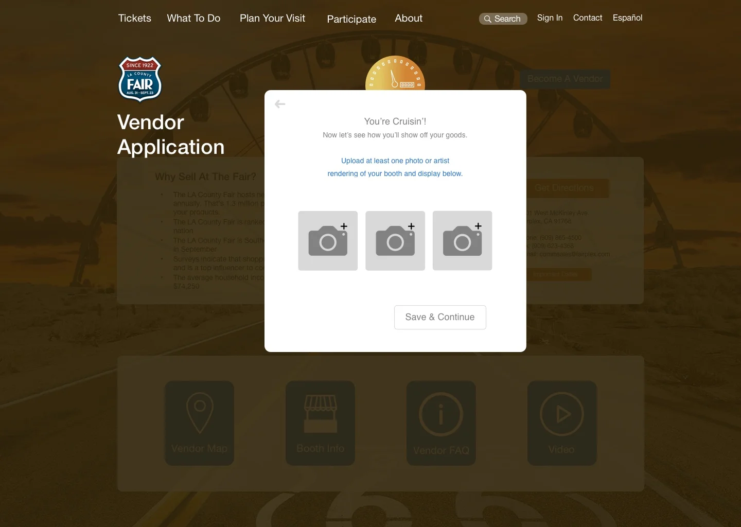
• The photo upload section was updated to be more user friendly.
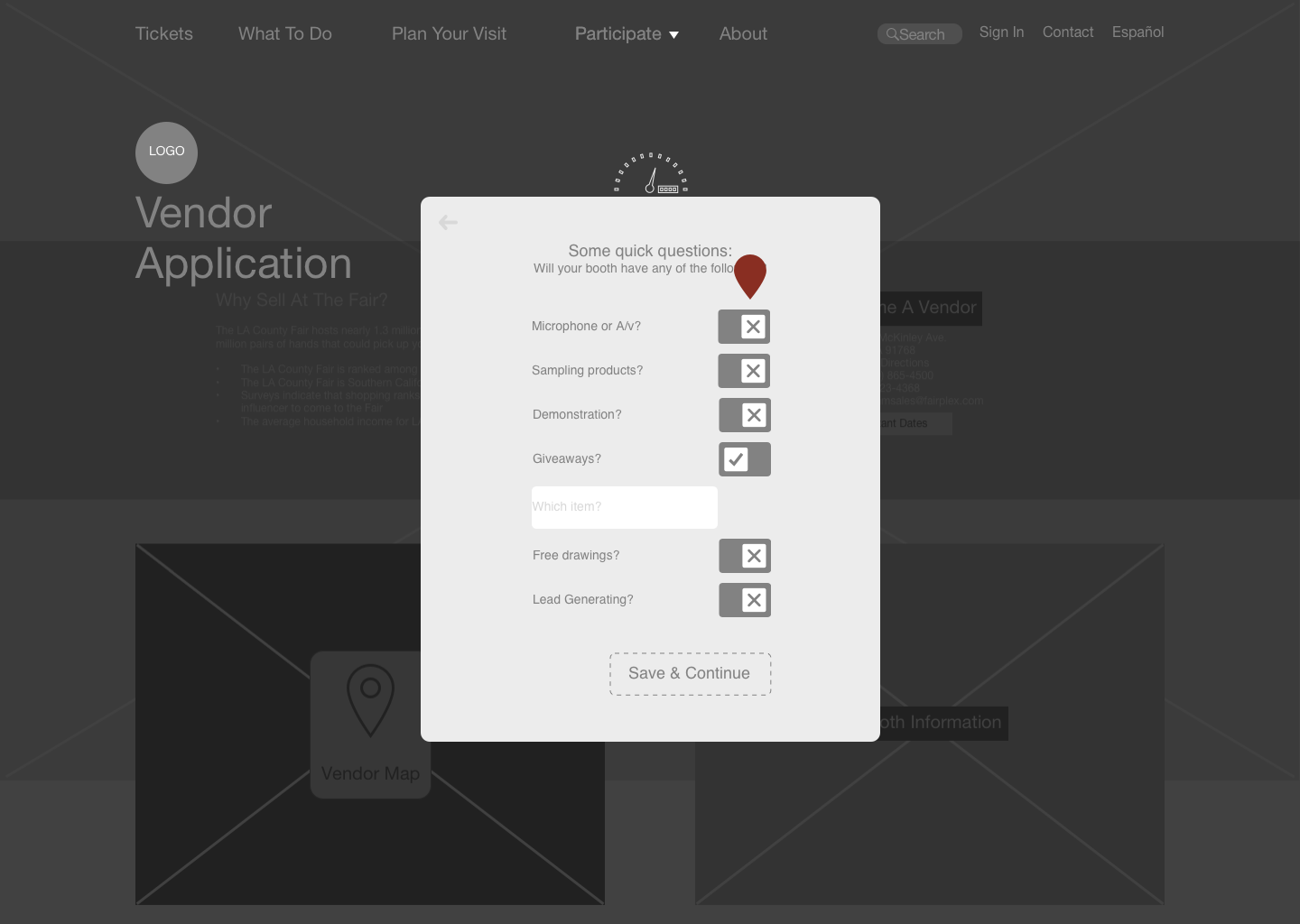
• Toggles were implemented to quickly list booth needs, expanding with entry boxes when checked.
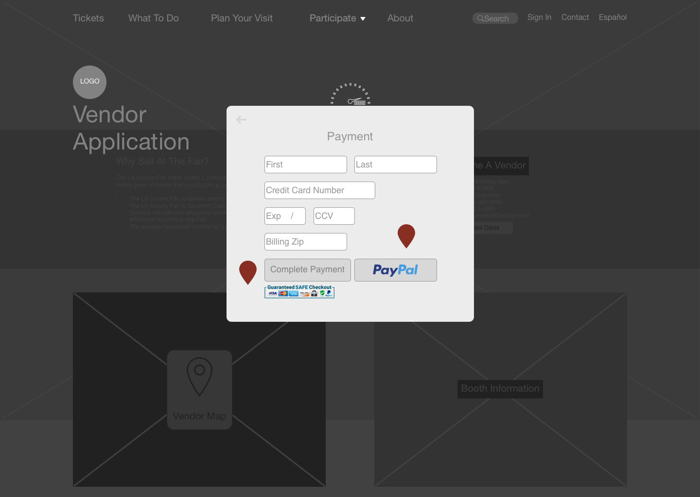
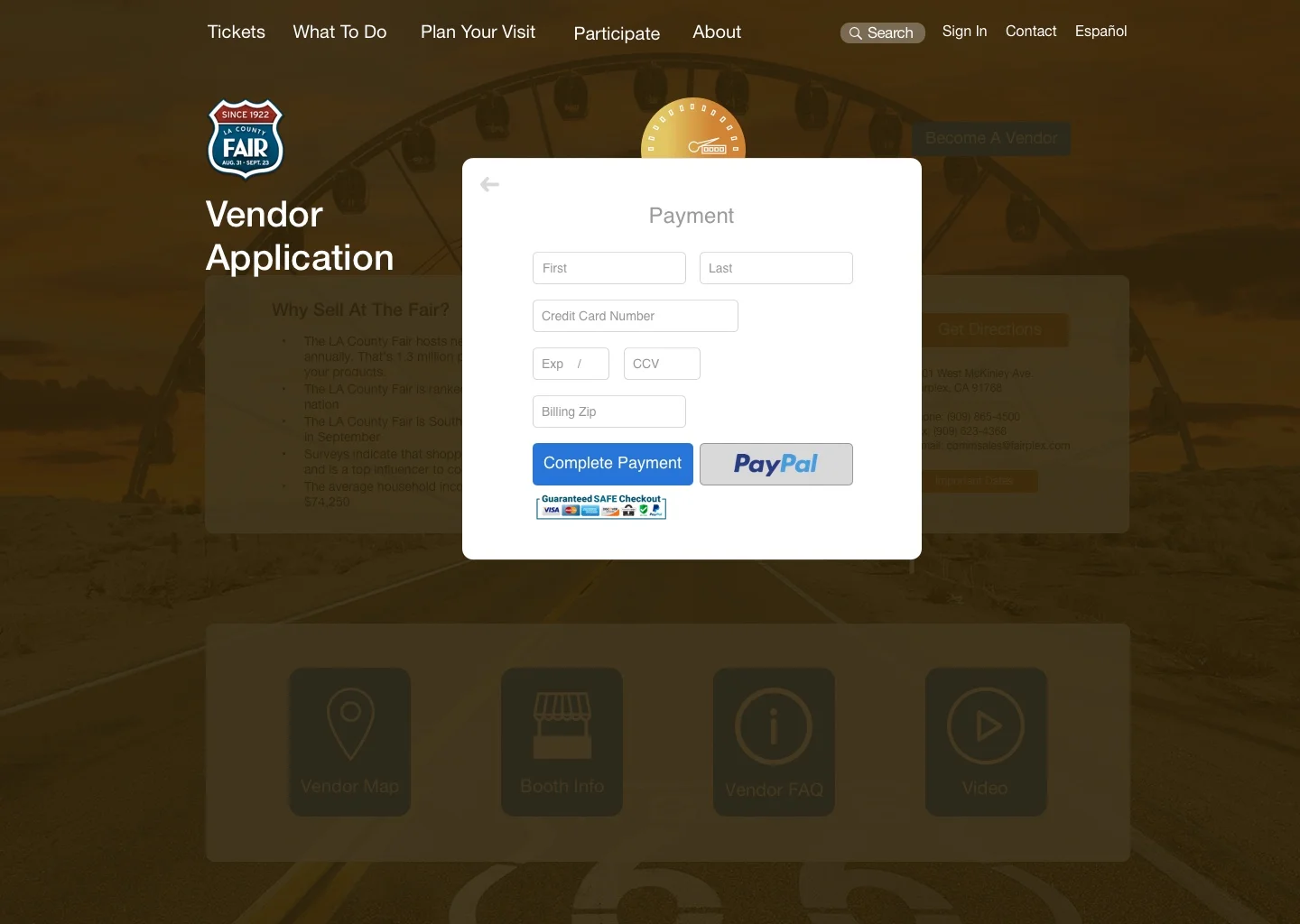
• It was necessary to offer assurances of secure payment for those with low trust in technology.
• A PayPal option was also offered for more tech-savvy generations.