
THE CLIENT
Choisi is an online fashion discovery platform that uses AI and machine learning to make smart recommendations that connect conscious, luxury consumers with up-and-coming international designers.
THE TASK
Implement a new product that allowed Choisi to gain new users and meet their funding goals.
THE SOLUTION
A complete user flow that offered multiple avenues of discoverability to browse different products and designers, and checkout, all contained within the Choisi ecosystem.
Choisi
Responsibilities:
Project Management, Research, UI Design.
Tools:
Sketch, Lucidchart, InVision, Paper & Pen
Time: 3 weeks
Research
Evaluating the existing site:
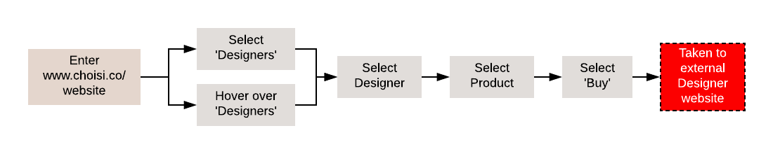
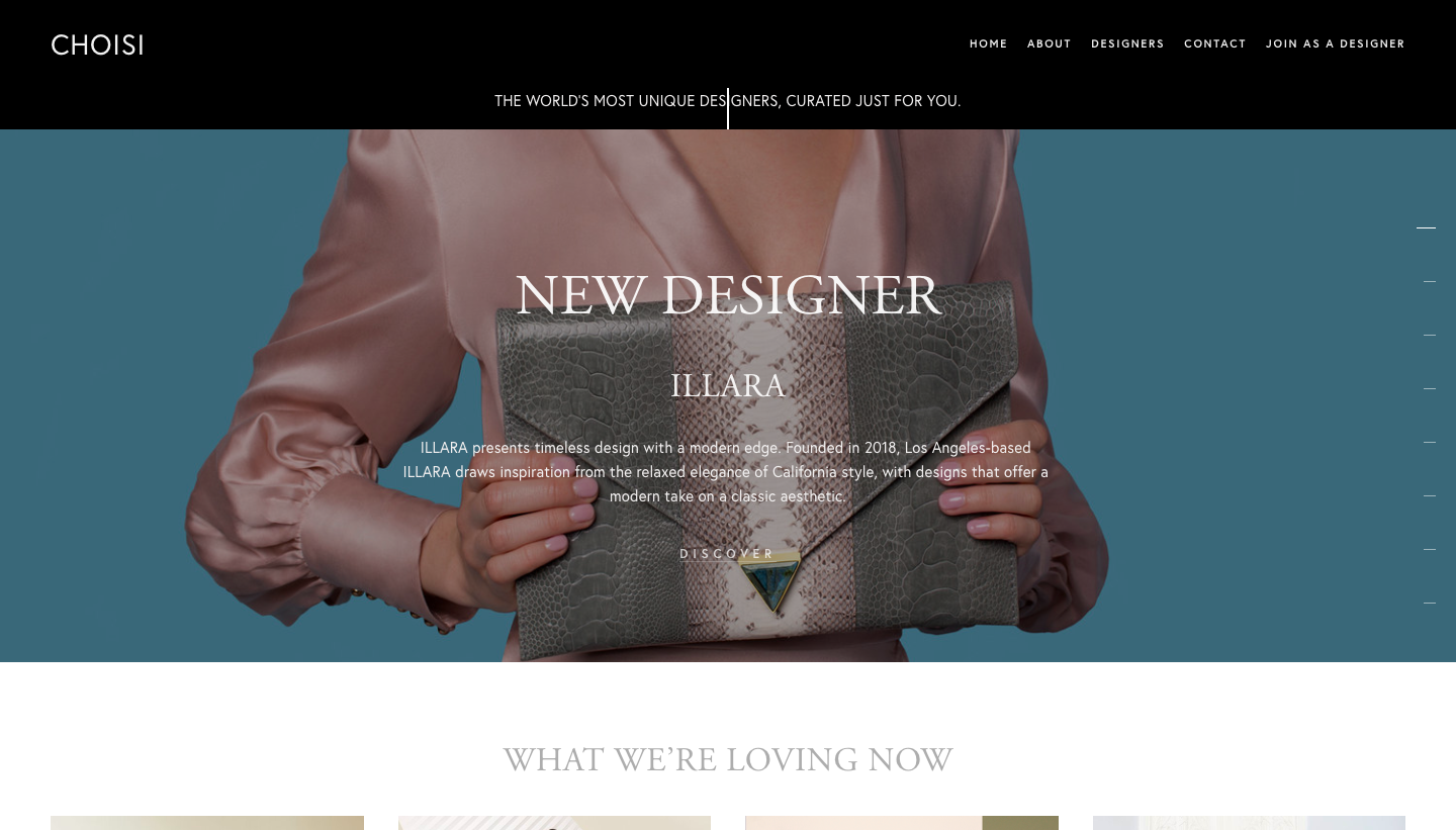
Above you can see the existing flow through the site. Any time a customer wants to explore deeper into a brand or item they are shuffled away from the Choisi ecosystem and into the designer’s own site.
Have a closer look with the video below:
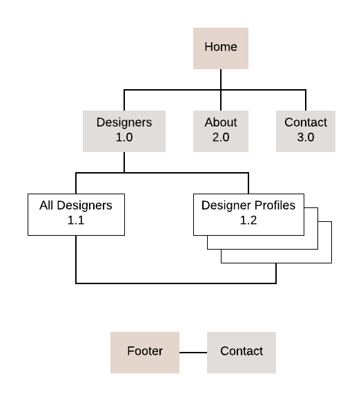
The site map for the existing website, showing the lack of depth to discoverability:
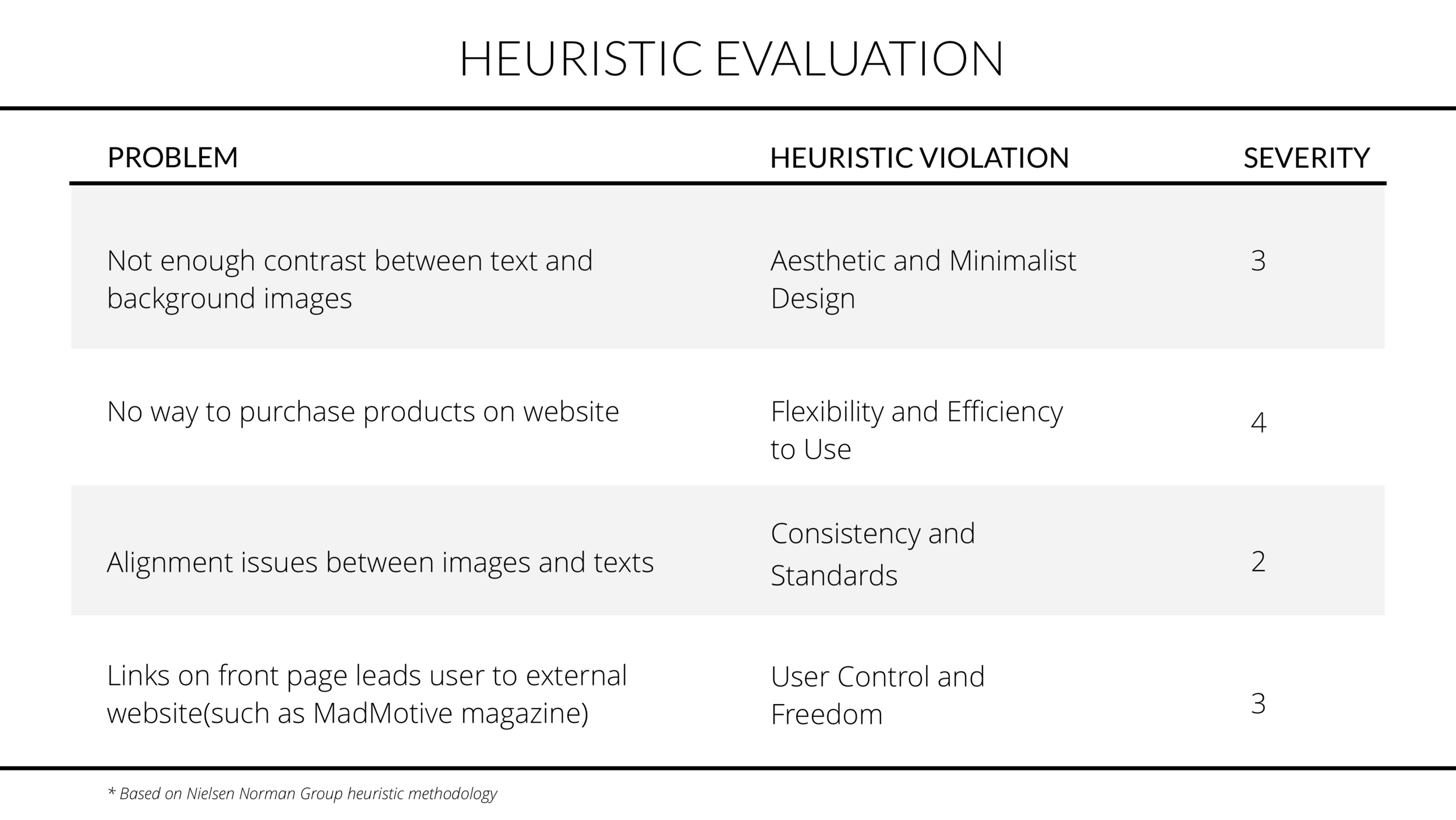
Some other key pain points identified in the existing site:
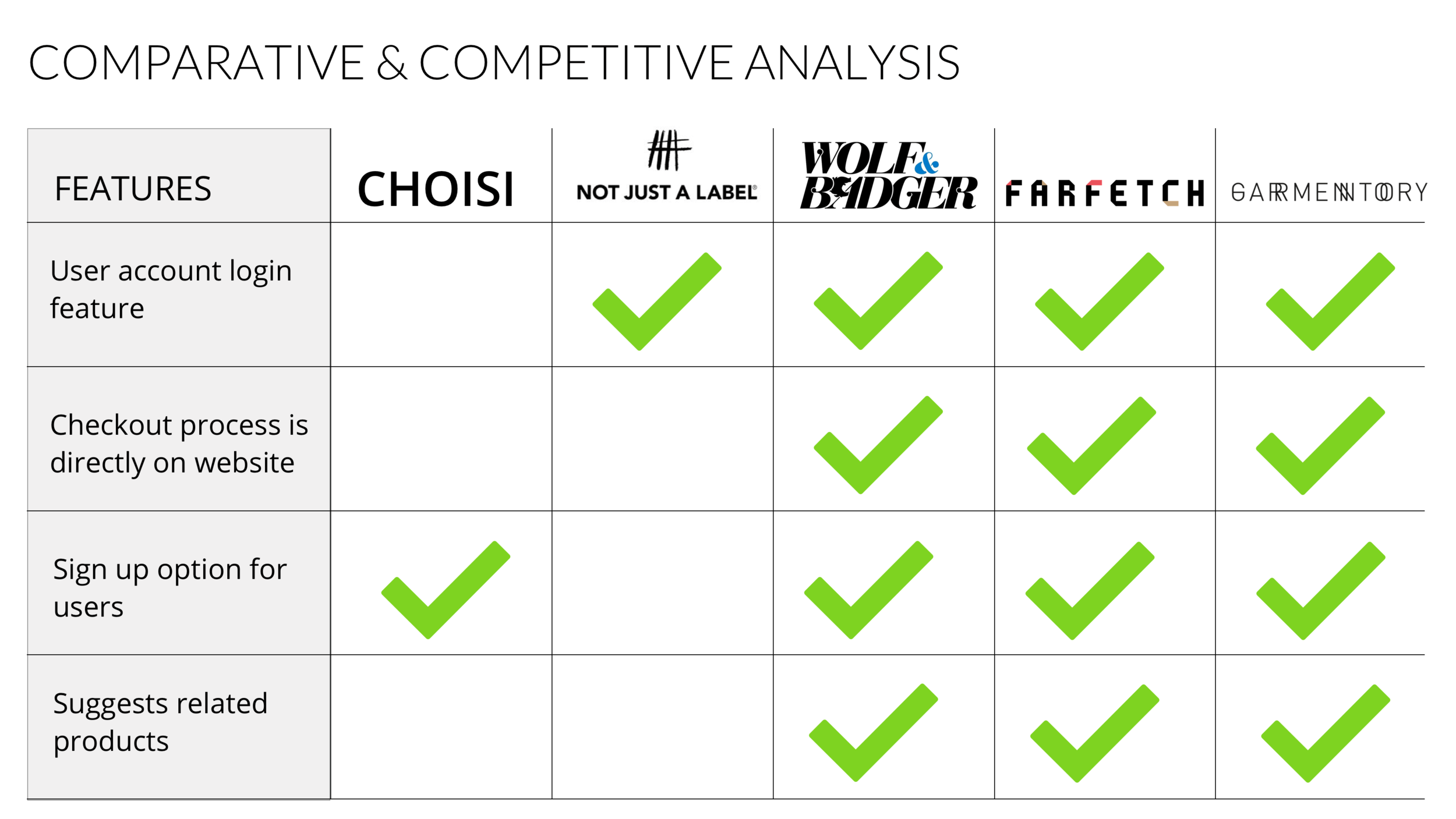
Evaluating the competition:
Understanding our users:
Using market research conducted by Deloitte in 2018, I found that customers would pay a premium for a personalized and unique product. I also found that customers are much more likely to purchase a product if it is socially or environmentally conscious.
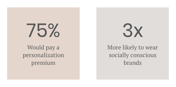
Market research conducted by Deloitte - 2018
Next, interviews were conducted with Choisi designers and women within the target demographic of the company - luxury goods consumers between the ages of 22 and 43.


Synthesis

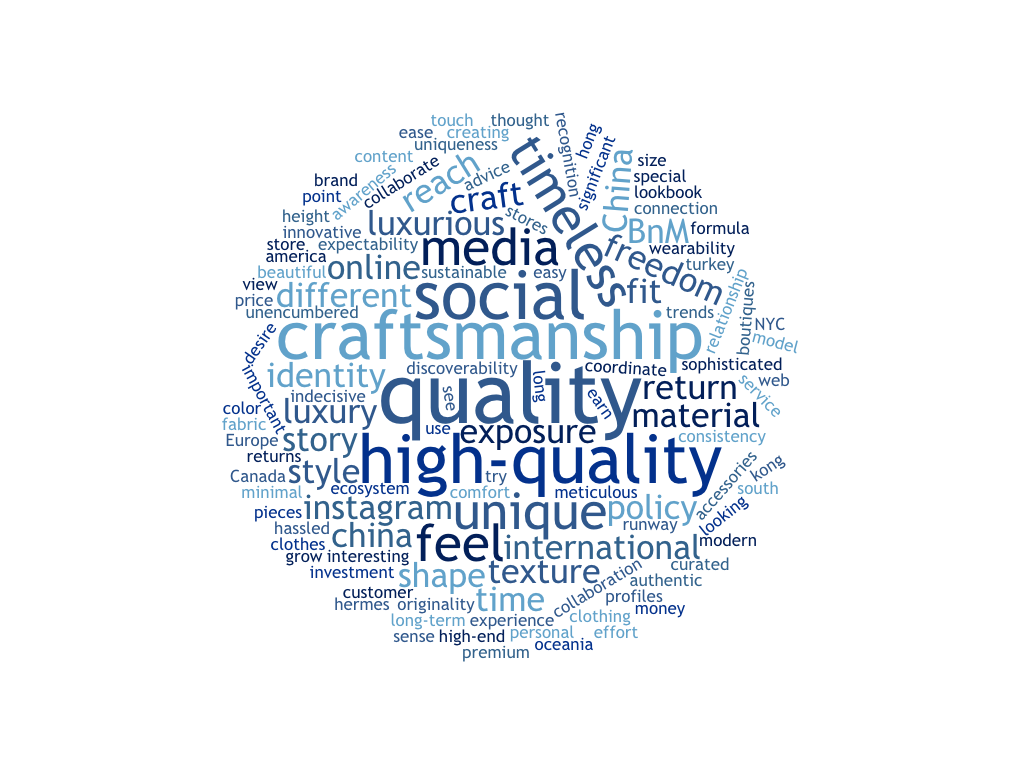
Word cloud of consolidated interviews.
Consumers look for quality and craftsmanship when purchasing a product and it is these qualities that independent designers value most when creating their products.
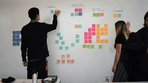
Using affinity maps we consolidated our qualitative data further.
FINDINGS:
Designers want to maximize access to customers, and customers want to maximize access to products, regardless of country borders, currencies, or preferred social media.
Brand story and product experience directly reflect one another
In shopping online, customers need to get as close to “hands-on” as possible.
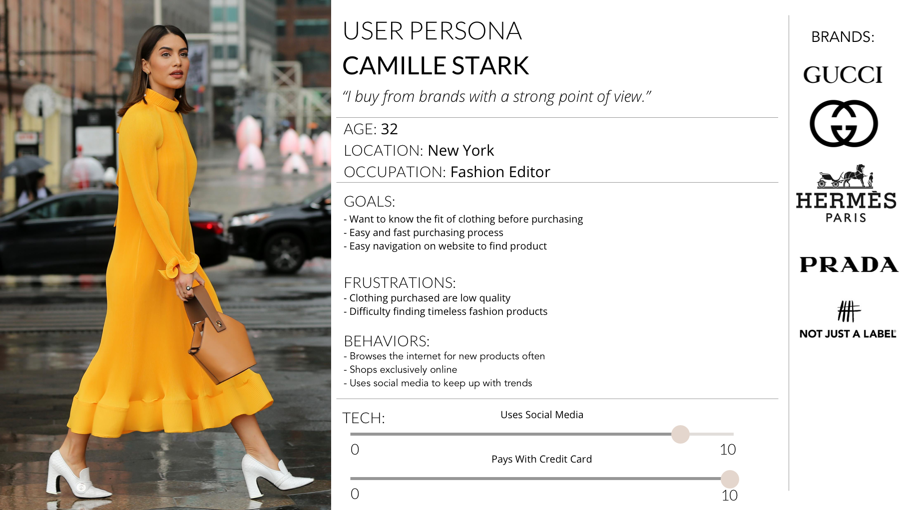
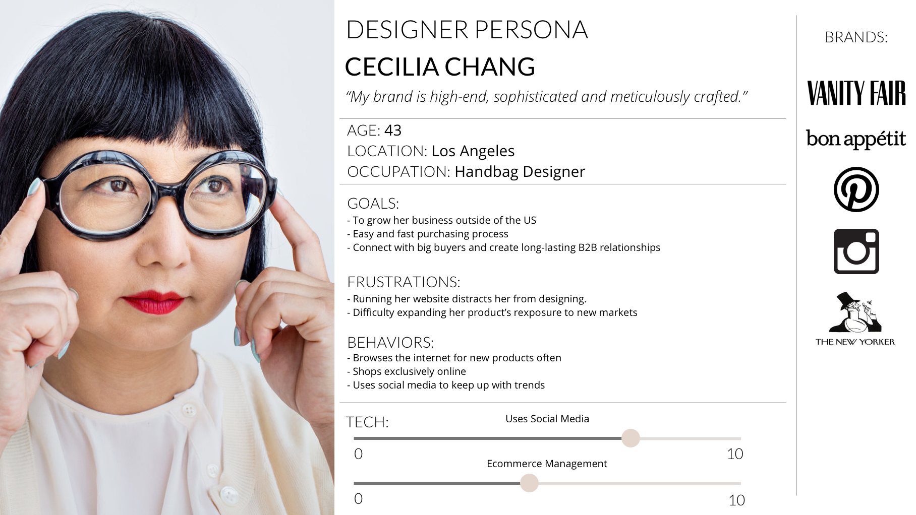
PERSONAS:
Design

Defining & Designing IA
The original site map: lacking depth and discoverability.
.VS.
The new site map: creating a more immersive experience.
With the big picture mapped out it was time to set about redesigning the ideal path through it.
The original user flow:
Users are shuffled away from the Choisi ecosystem and into the designer’s own site any time a customer wants to explore deeper into a brand or item.

.VS.
The new user flow:
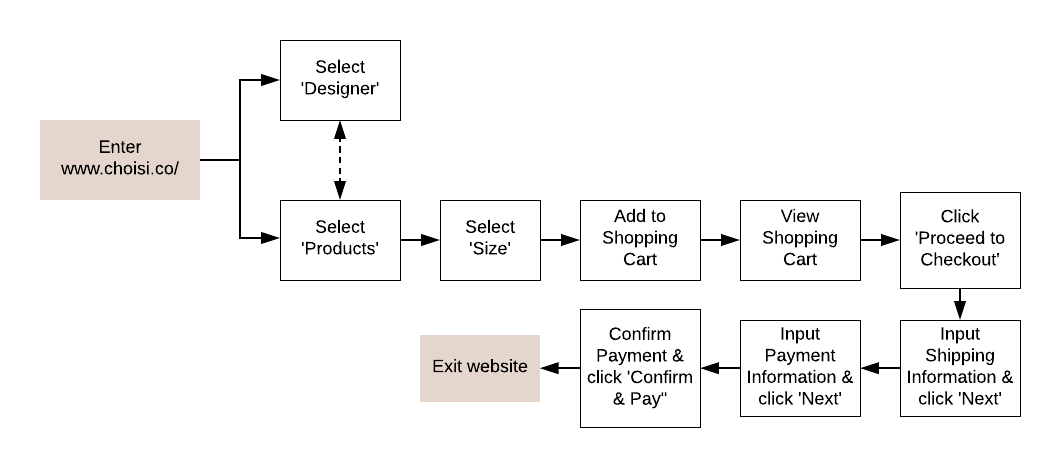
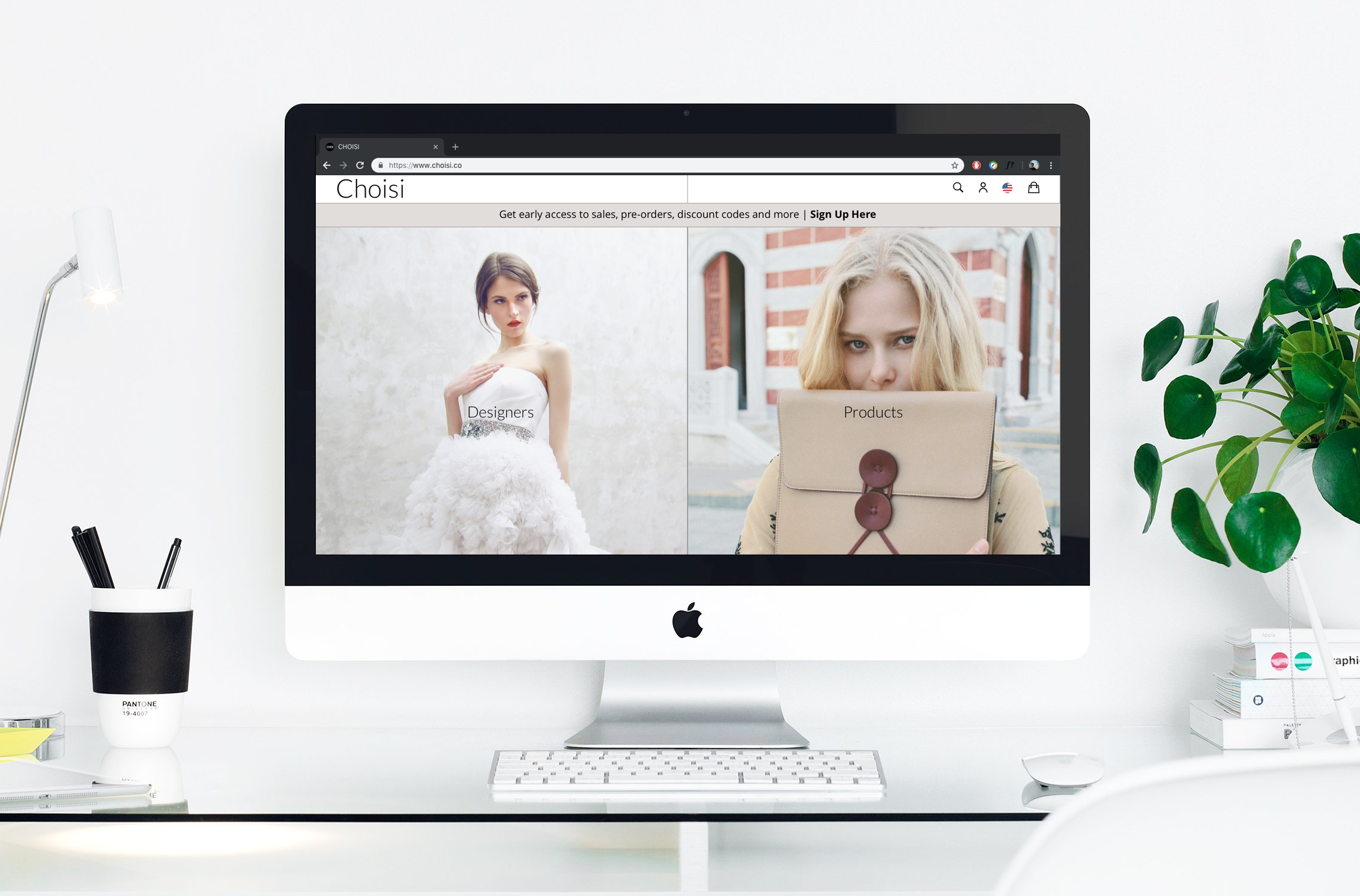
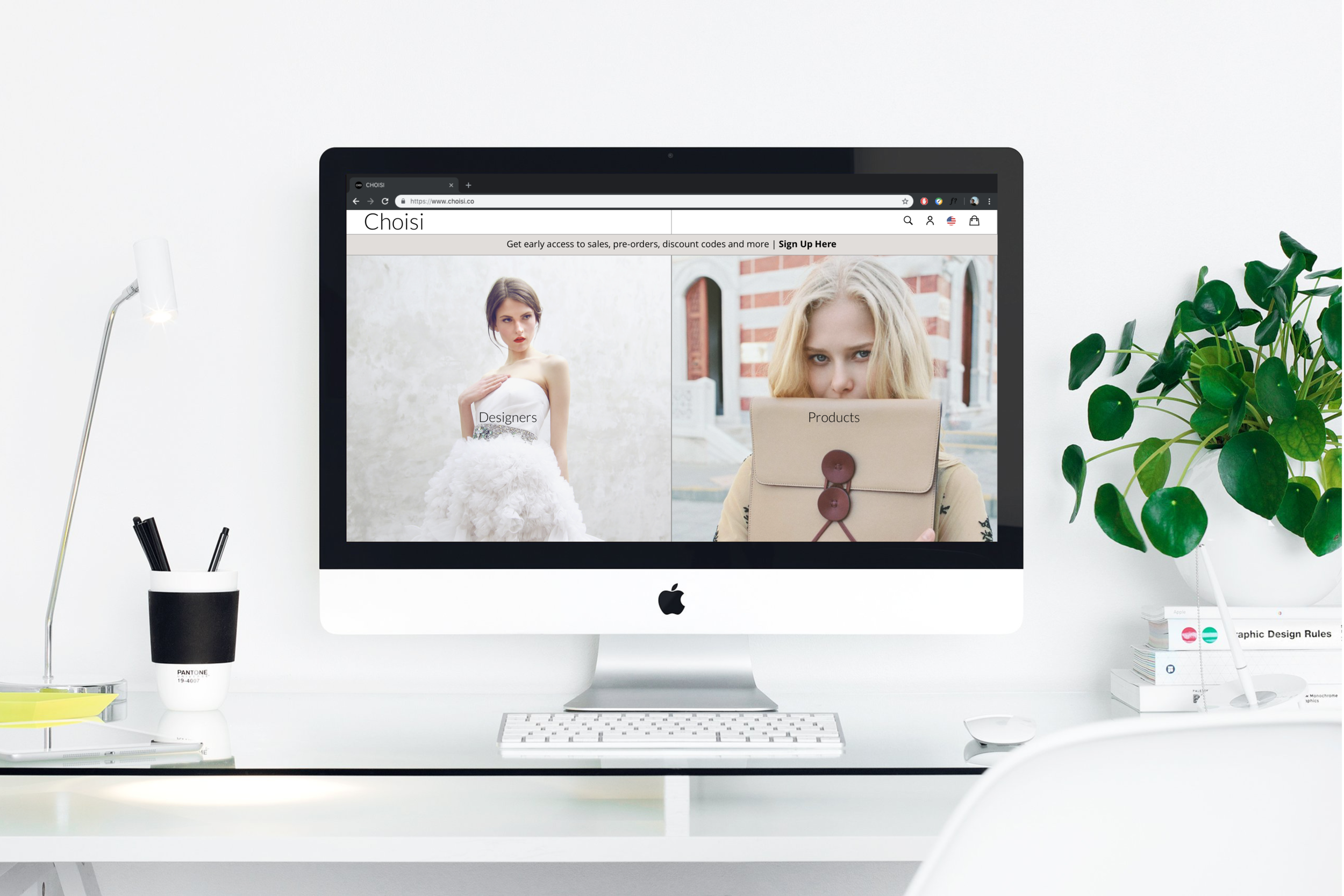
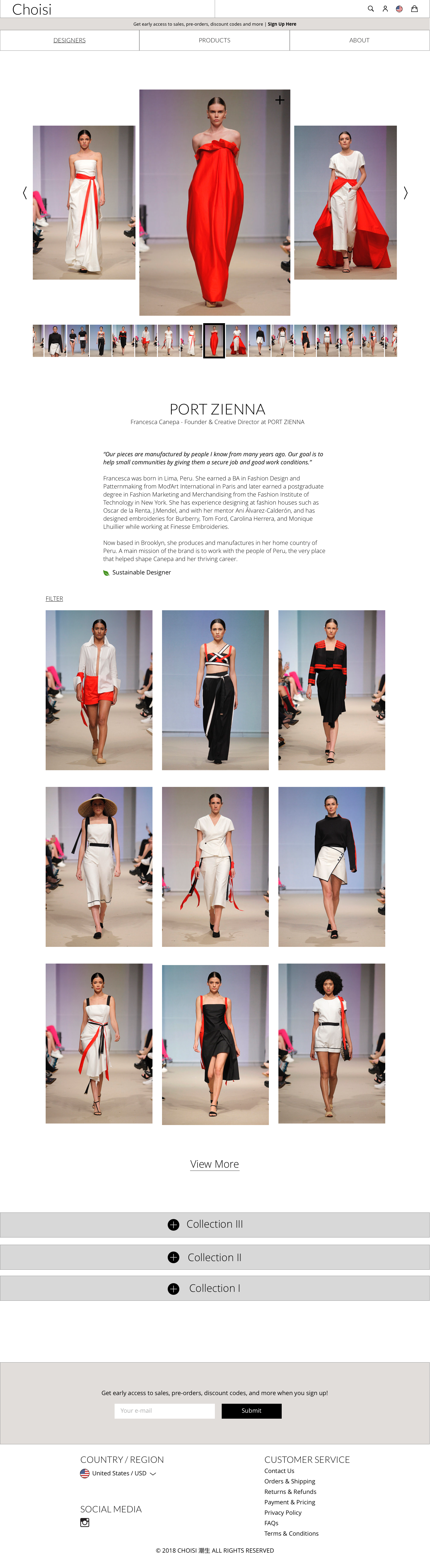
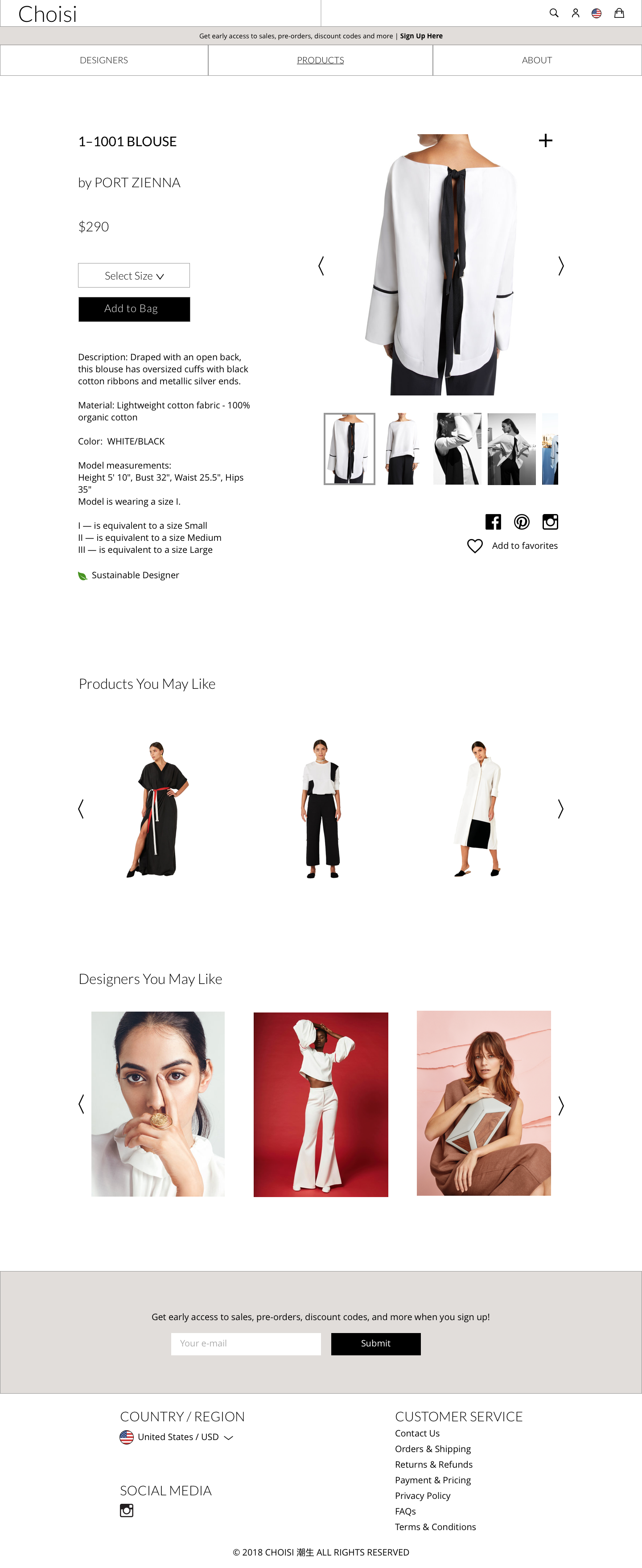
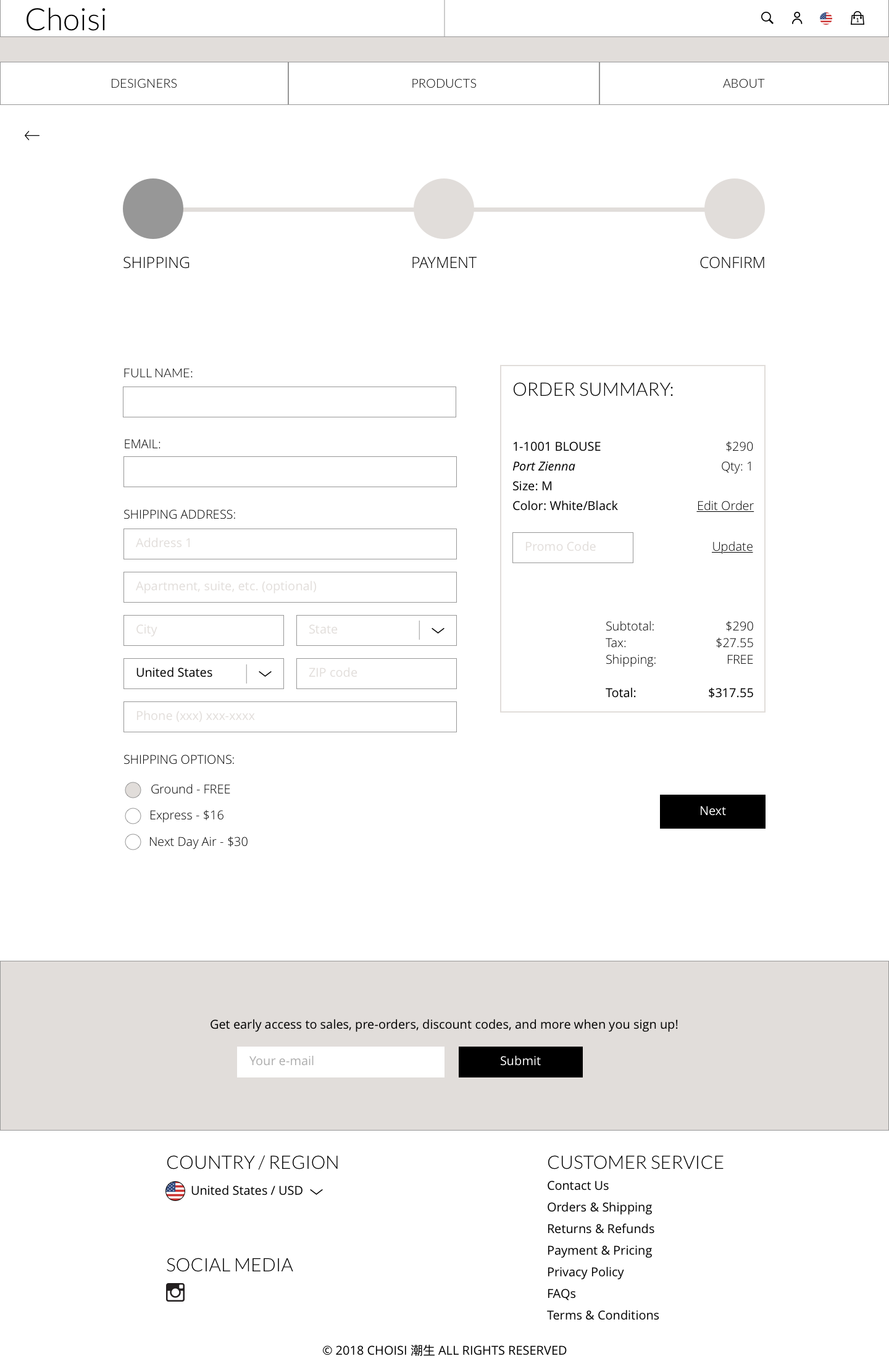
This new flow keeps the user contained entirely within the Choisi ecosystem - from entry and discovery all the way through checkout.
Design Studios
With the new flow in mind it was time to begin designing wireframes.
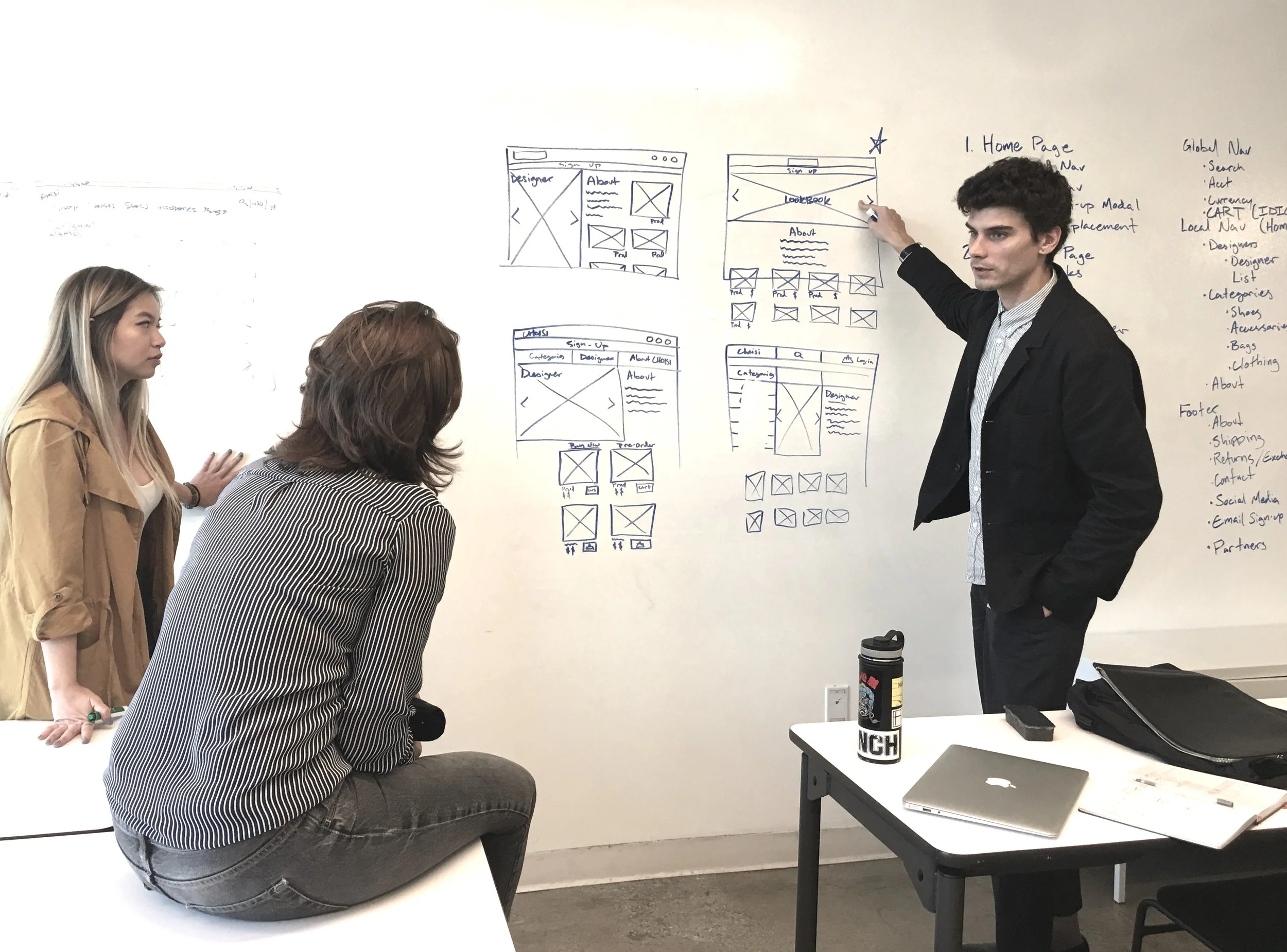
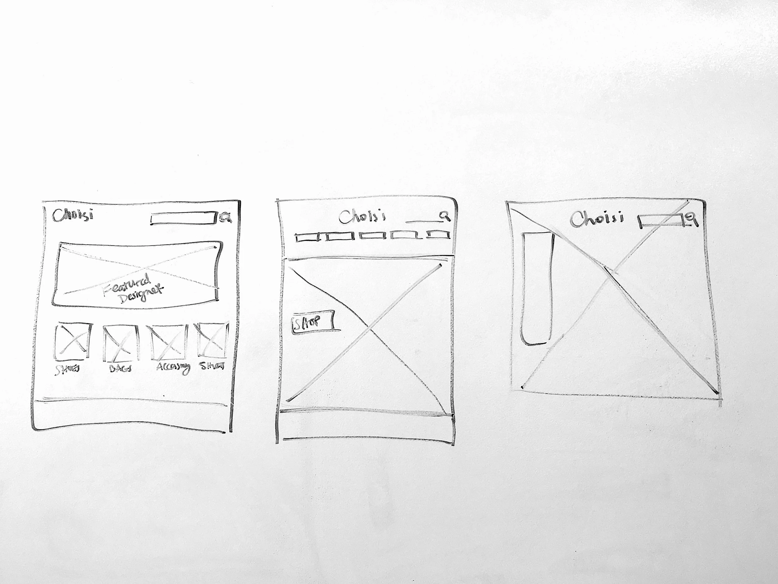
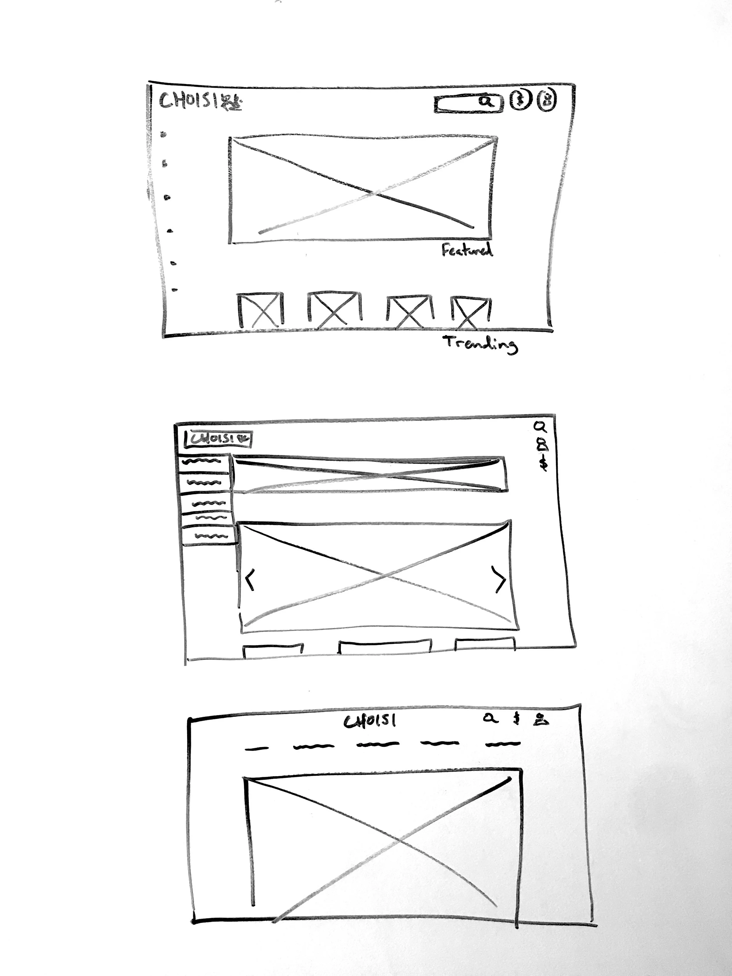
Design studios allowed the team to exchange ideas quickly and arrive at a solution all could agree on.
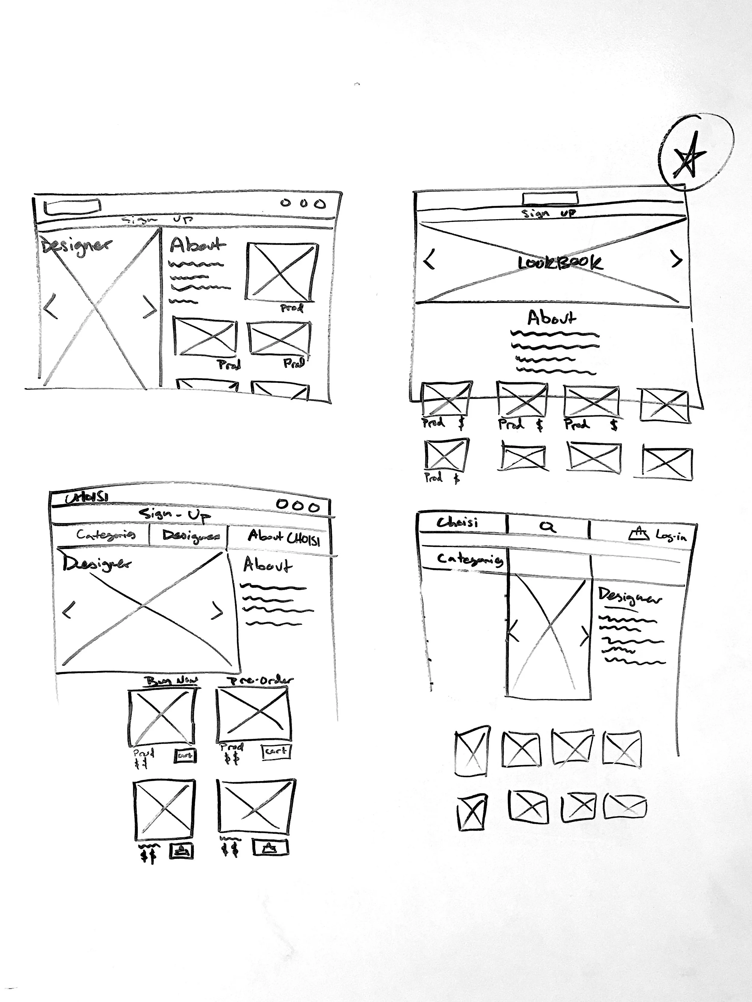
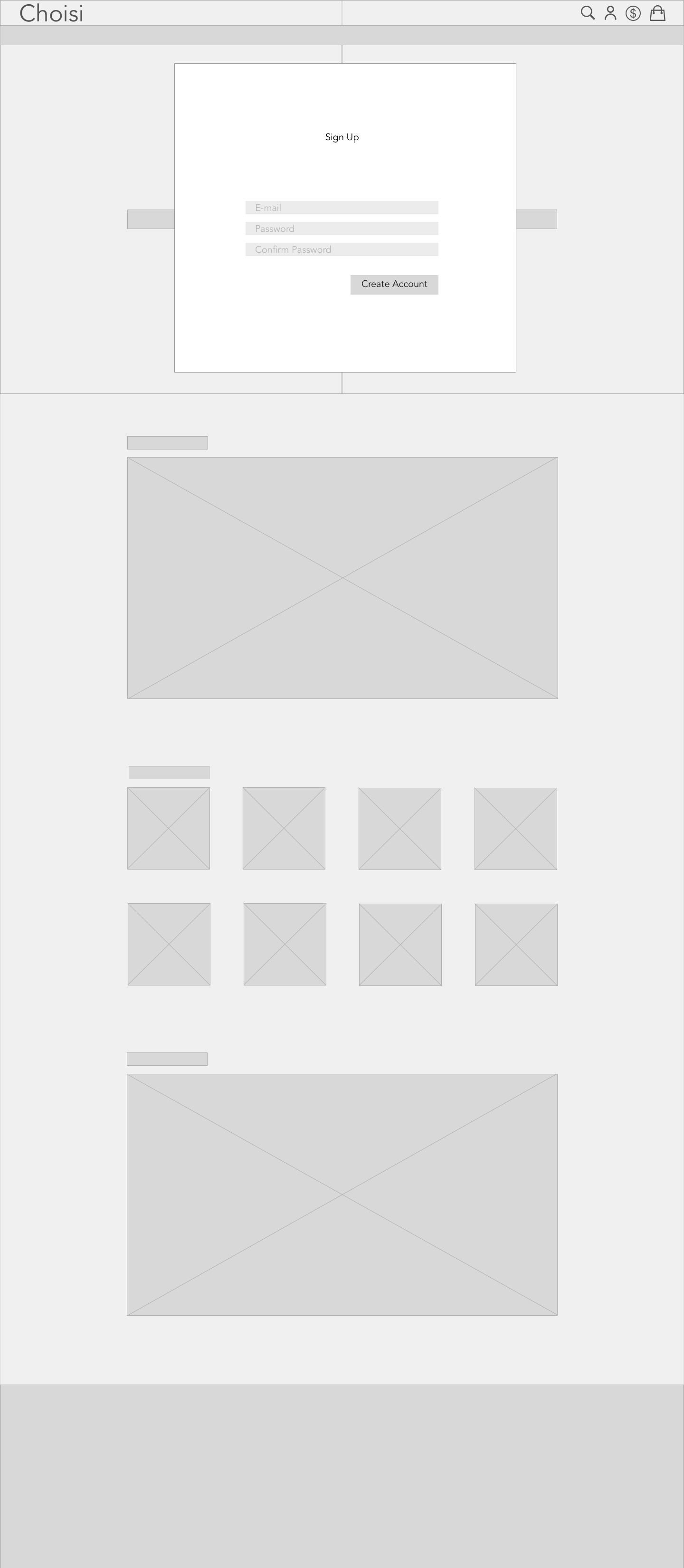
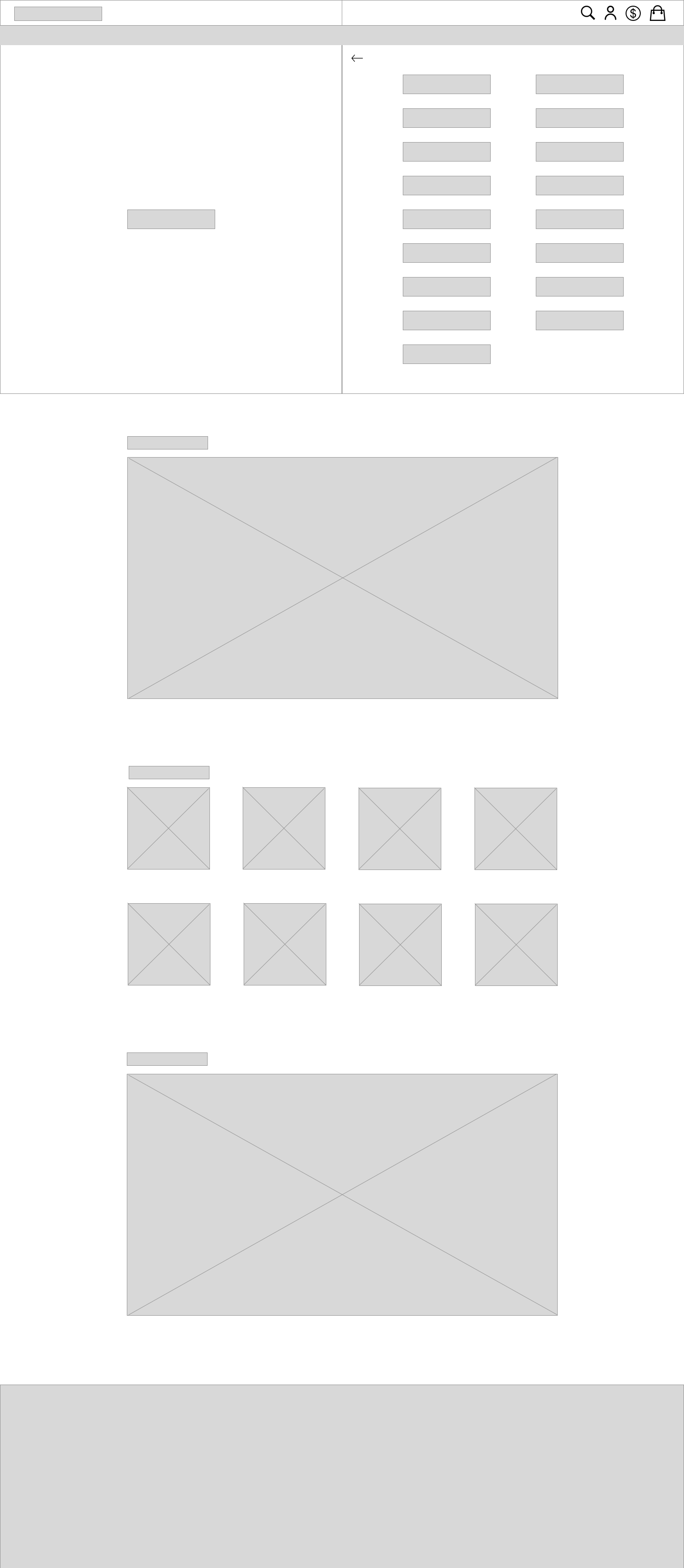
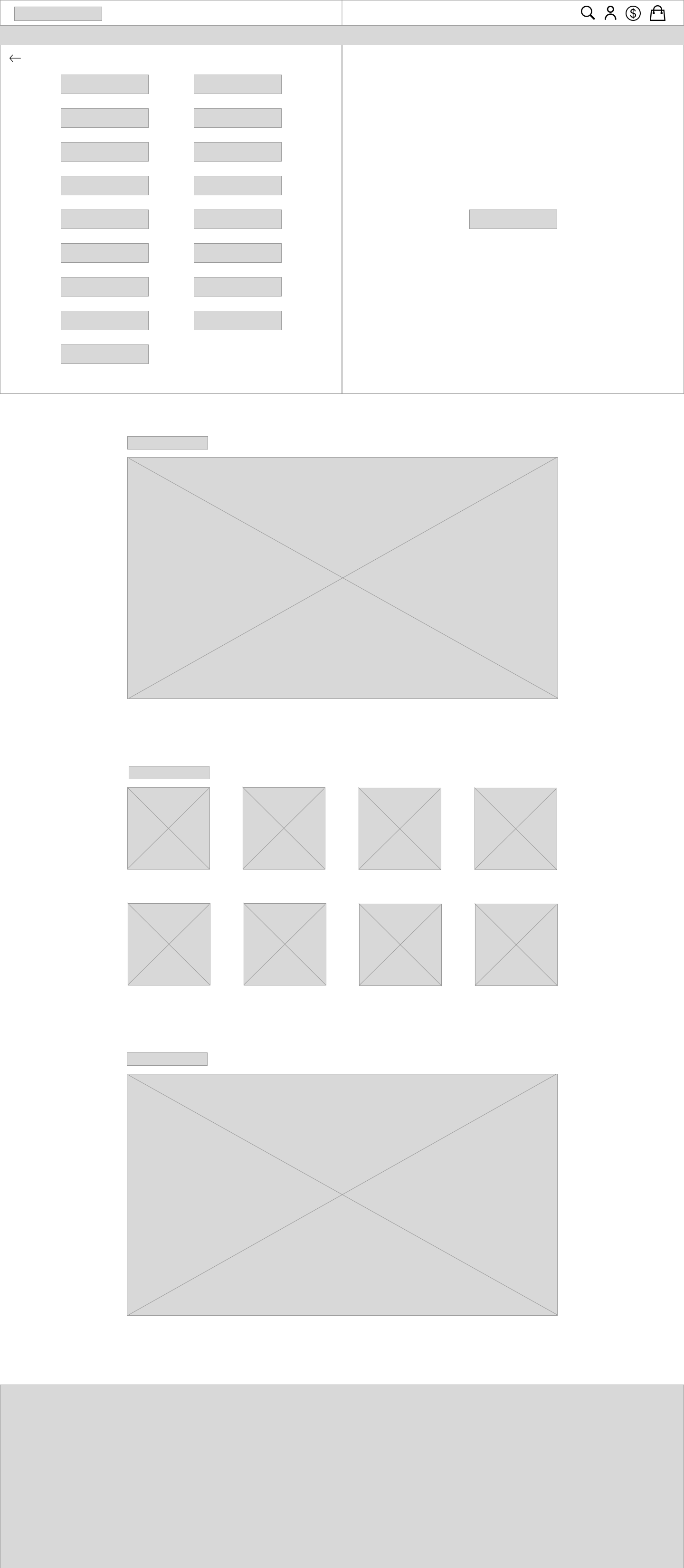
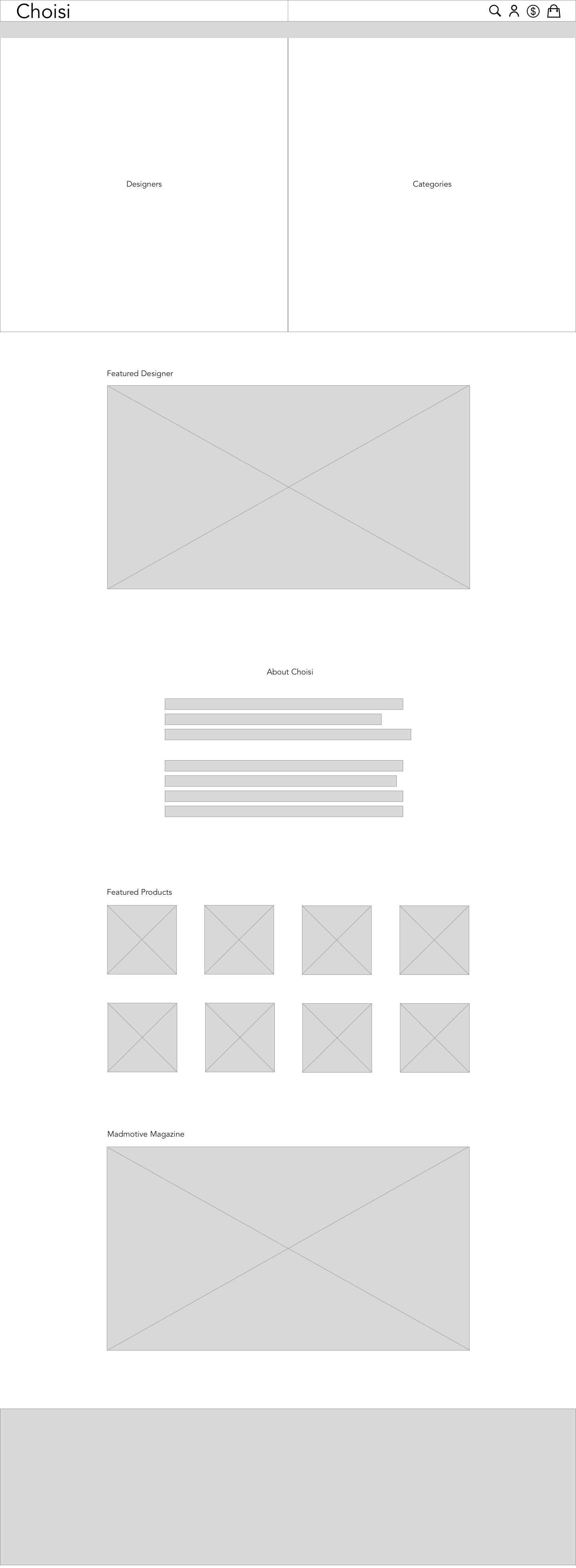
Low & Mid Fidelity Wireframes
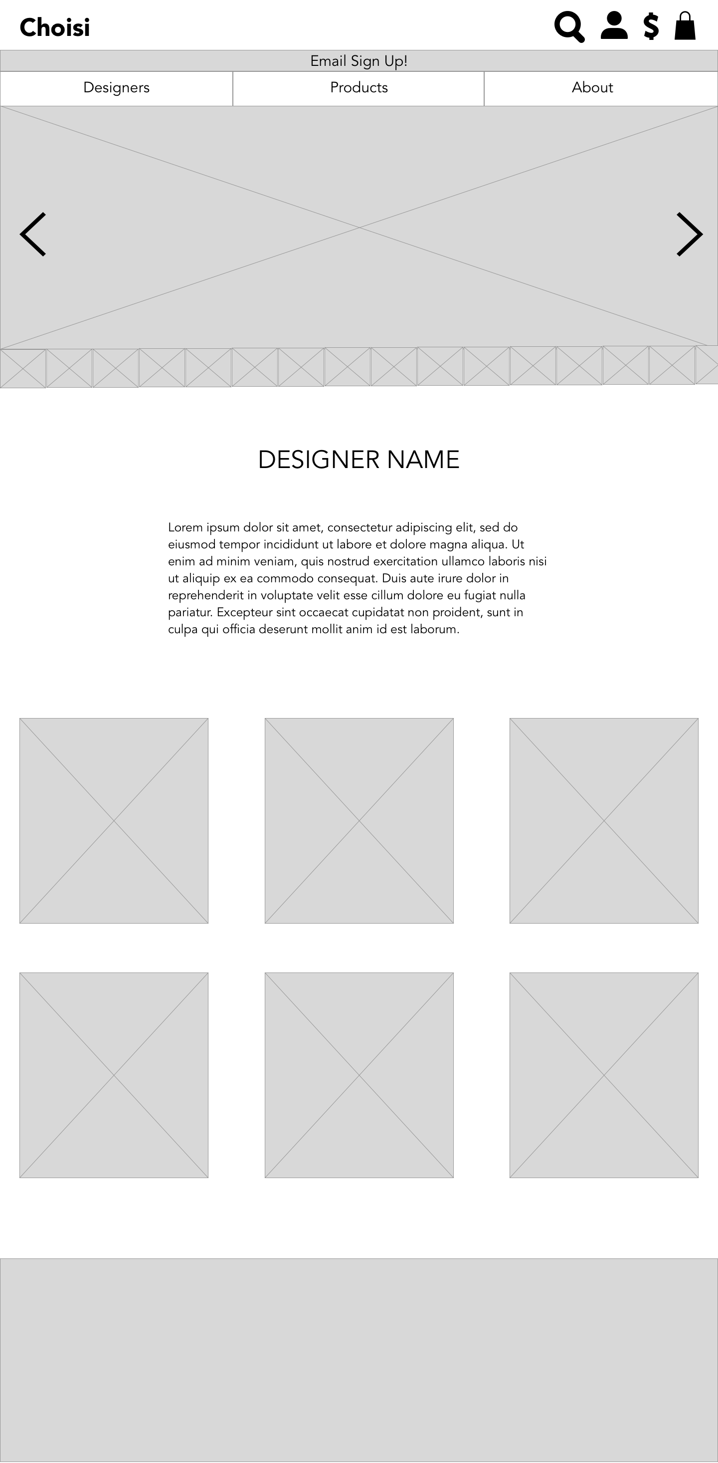
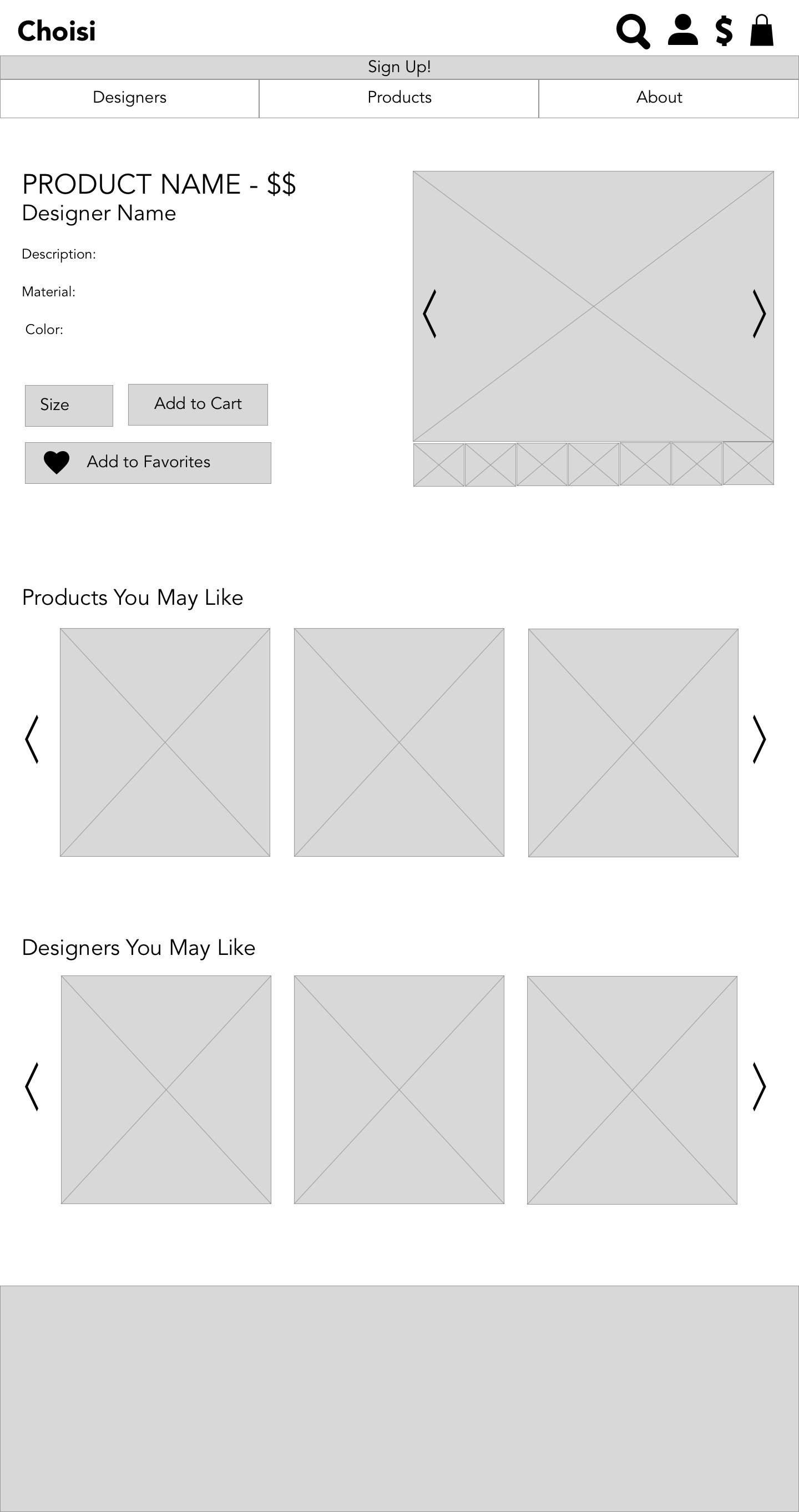
High Fidelity Wireframes
Once tests showed that our mid-fidelity wires were easy to navigate it was time to flesh them out in high fidelity.
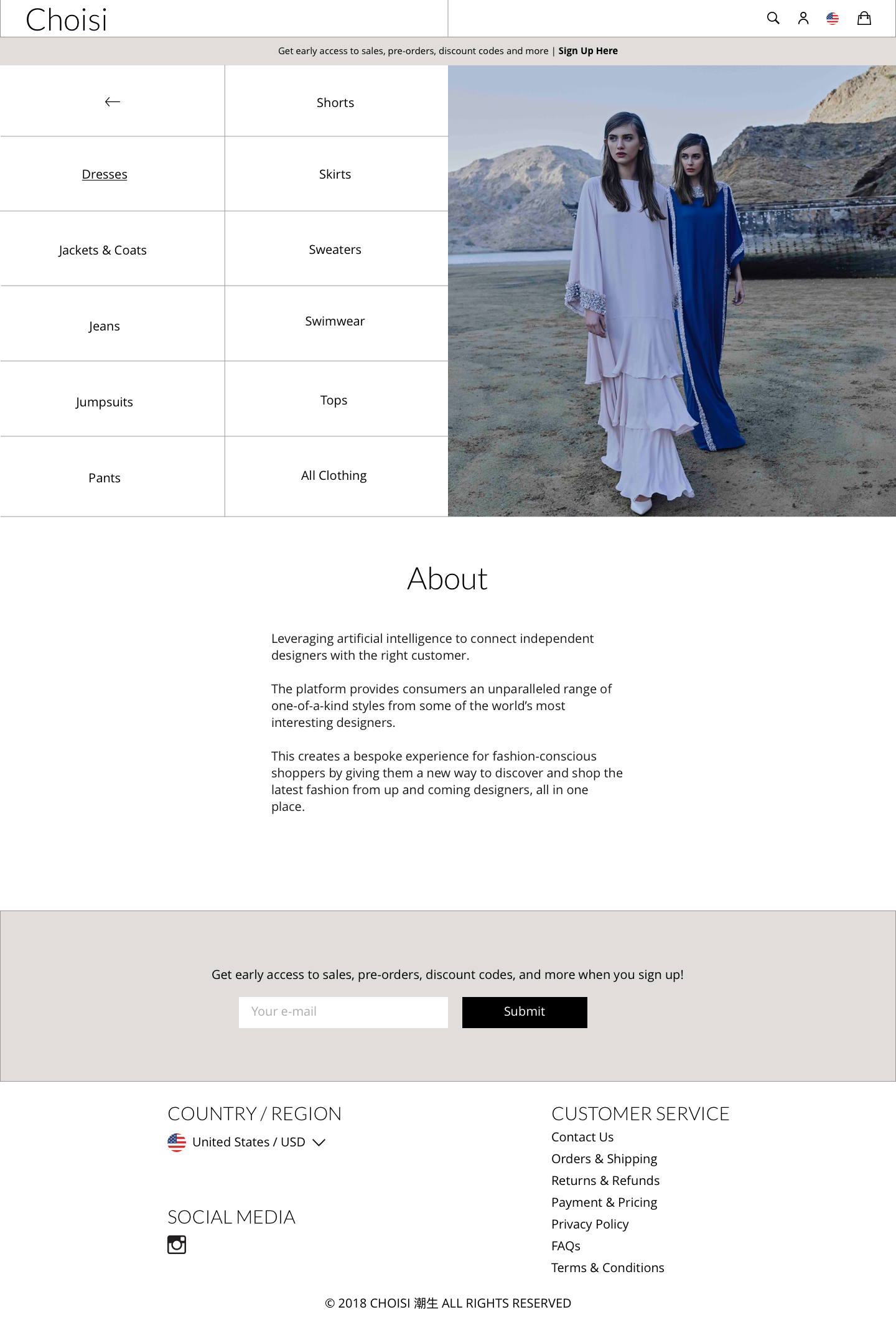

Mobile + Tablet
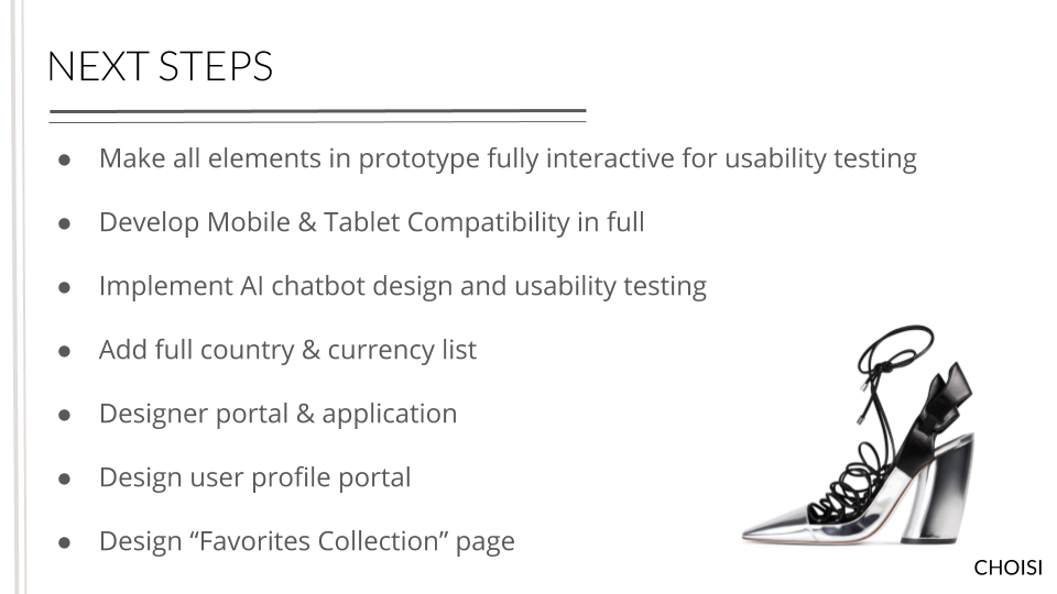
Although the final prototype was for desktop we still wanted to consider the layout for mobile and tablet - even if they wouldn’t manifest in a similar, completed flow.
Delivery

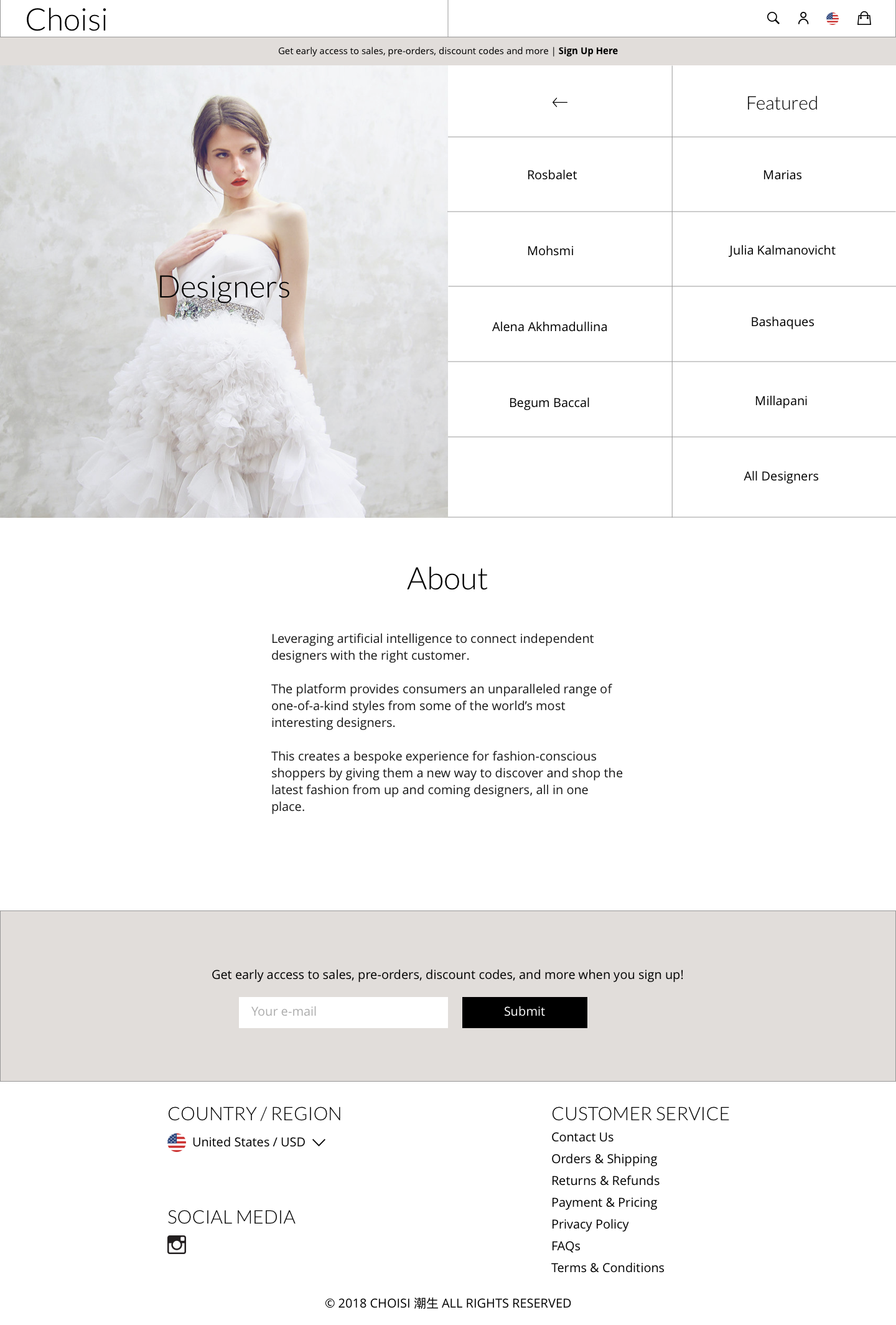
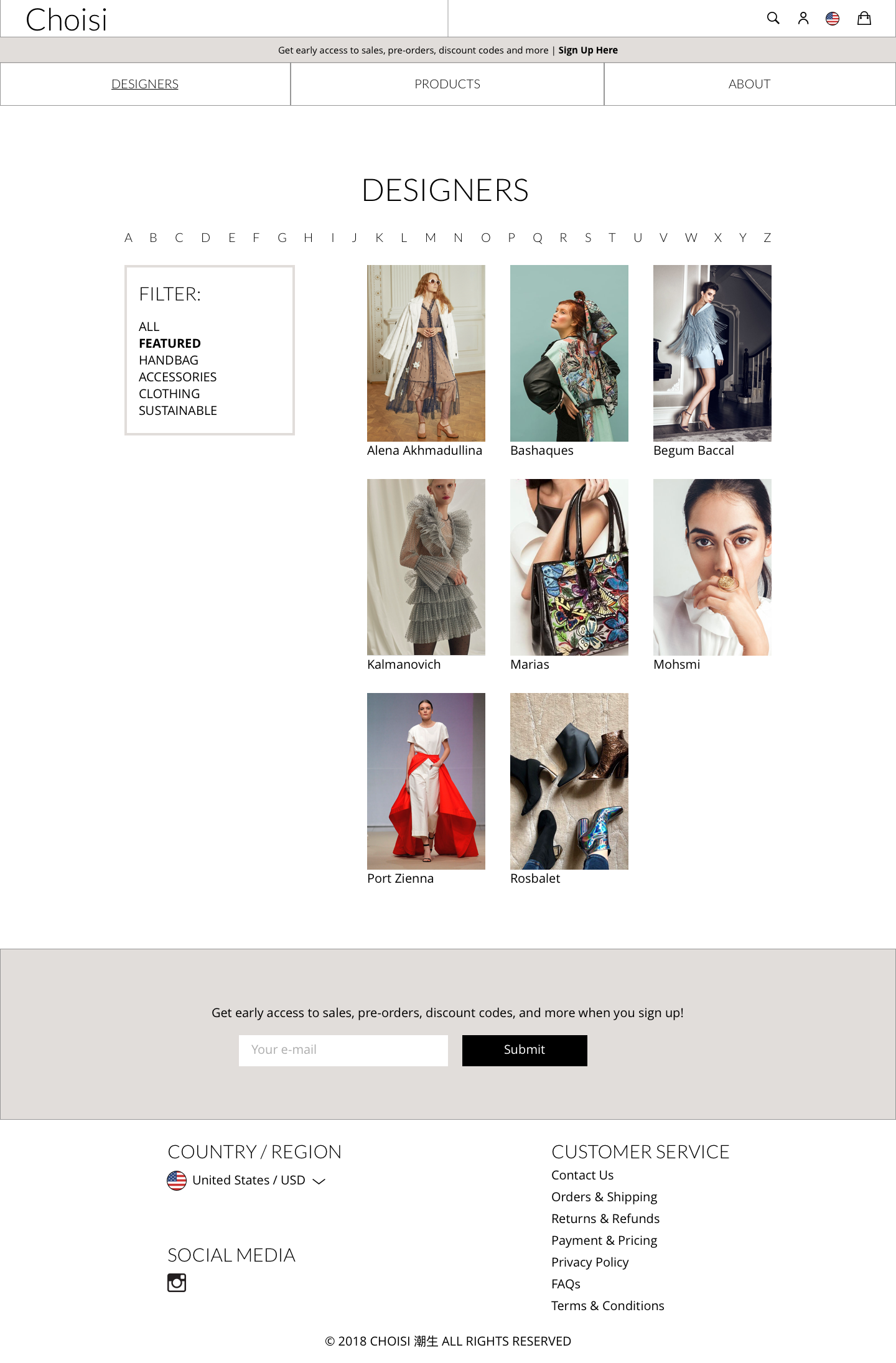
FINAL PROTOTYPE